

Bunker Surf & Skate Malibu
Project Summary
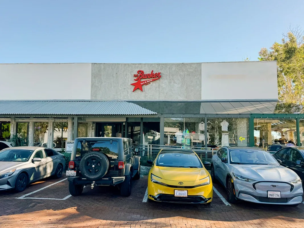
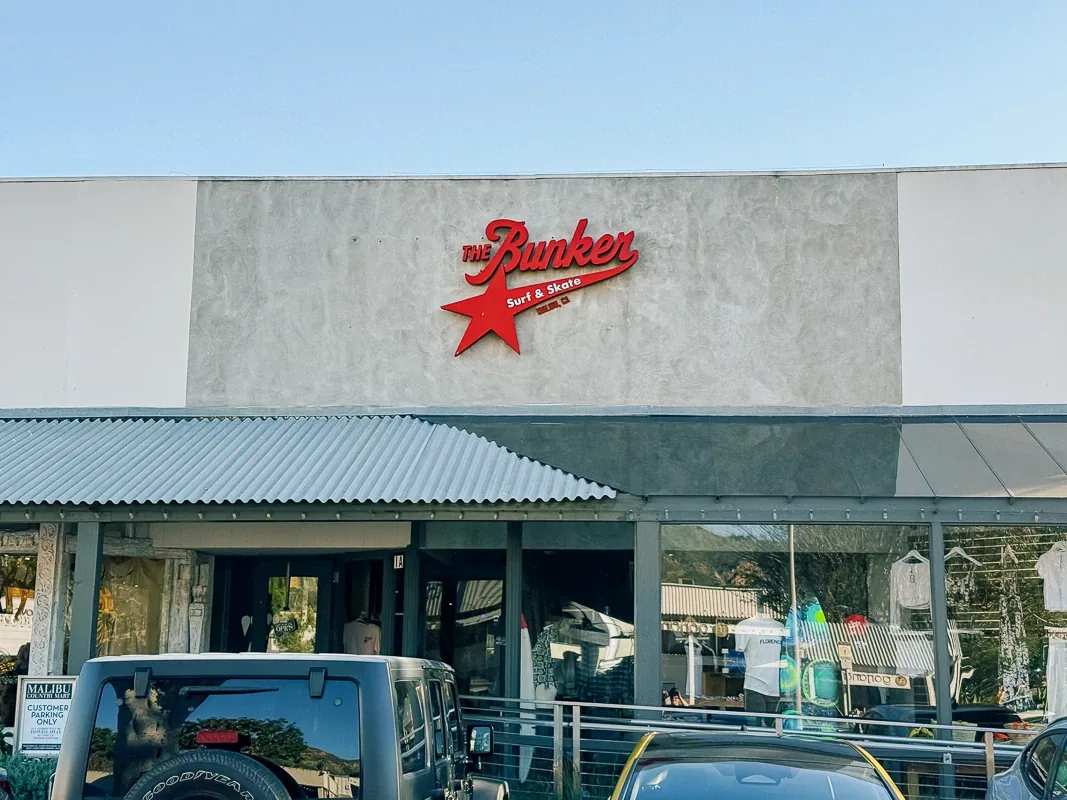
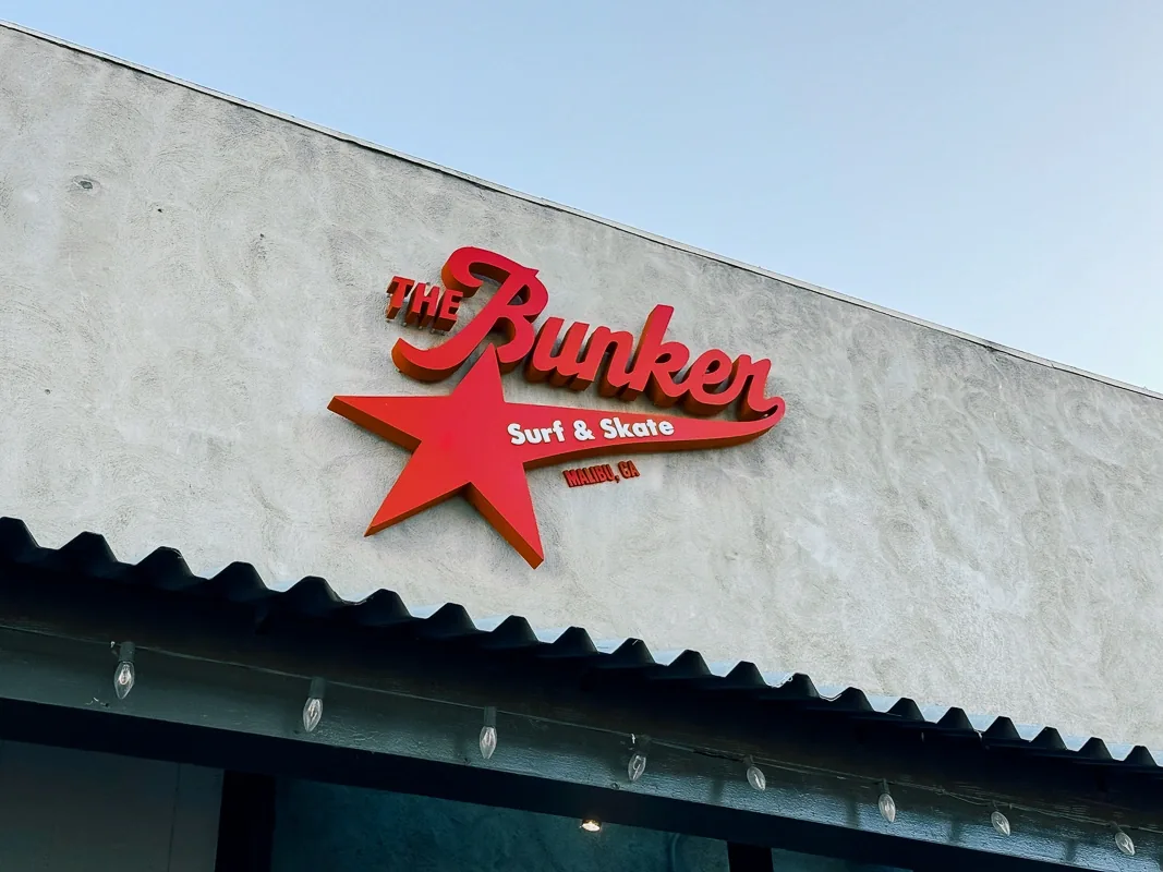
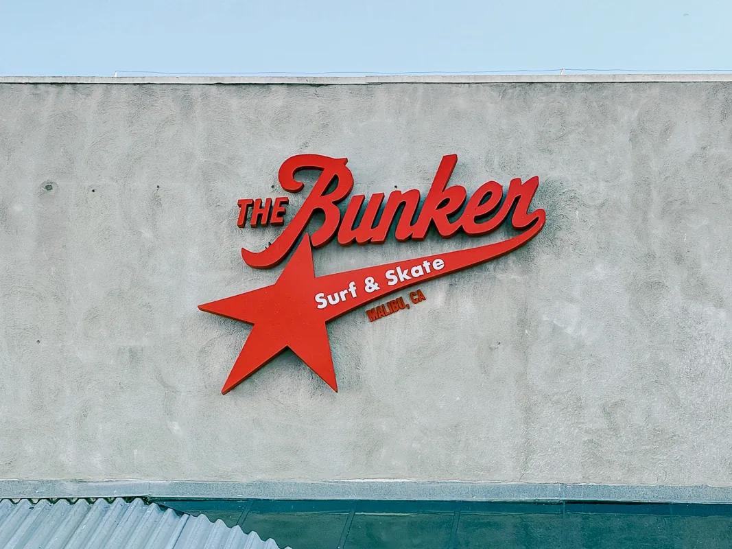
The Bunker Surf & Skate, a retail shop on Cross Creek Road in Malibu, needed a storefront sign that would read from the road and the parking area within a continuous retail facade. Signature Signs installed halo-illuminated channel letters based on the brand's script logotype, with an integrated star element, scaled to the horizontal band above the entrance.
What We Built
- Halo-illuminated dimensional channel letters in the brand's script logotype
- Integrated star element extending the sign's visual footprint
- Secondary text incorporated into the main composition
- Mounted directly on the facade, centered in the band above the entrance
Project Note
The available wall space was limited to a horizontal band above the entrance, within a continuous facade shared with other retail storefronts.
Project Story
Located along Cross Creek Road in Malibu, The Bunker Surf & Skate operates within a retail strip where visibility depends on clarity and proportion. The storefront sits within a continuous façade line, requiring signage that can be read both from the road and from the parking area directly in front.
The Challenge: Creating Presence Within a Continuous Façade
The storefront required a sign that would define the business clearly within a shared retail environment. The available wall space was limited to a horizontal band above the entrance, and the sign needed to work within that structure without disrupting the overall composition.
The goal was to:
- Ensure clear readability from a distance
- Maintain alignment with the building’s architectural lines
- Introduce visibility without excessive brightness
- Keep the composition balanced within the façade
The Solution: Halo-Illuminated Channel Letter Sign
The final solution was a set of dimensional channel letters based on the brand’s script logotype, combined with an integrated star element.
The sign was mounted directly onto the façade and scaled to better occupy the available wall space. Internal illumination creates a halo effect, allowing the lettering to remain visible at night without direct glare.
Secondary text was incorporated into the main composition, maintaining hierarchy while keeping the overall form compact and legible.
Design Considerations
The design focused on proportion, visibility, and control:
- Placement and Scale: Positioned centrally within the façade band and sized for visibility from both street and parking
- Halo Illumination: Indirect lighting ensures legibility without overpowering the storefront at night
- Compositional Balance: The star element extends the visual footprint while keeping the structure compact
- Architectural Alignment: The sign follows the horizontal rhythm of the building
The Impact: A Storefront That Reads Clearly Day and Night
The installed sign provides a clear visual anchor for the storefront. From the road, the business is identifiable earlier, and from the parking area, the sign reads without effort.
At night, the halo illumination defines the lettering against the façade, maintaining visibility while preserving a controlled appearance.
Key Benefits
- Improved Visibility: Clear identification from both street and parking approach
- Consistent Readability: Effective in varying lighting conditions
- Balanced Presence: Scaled to fit the façade without overwhelming it
- Brand Clarity: Logotype and symbol work as a unified composition
This project focuses on clarity, proportion, and controlled illumination. The result is a storefront sign that integrates with the building while giving the business a defined and reliable presence.