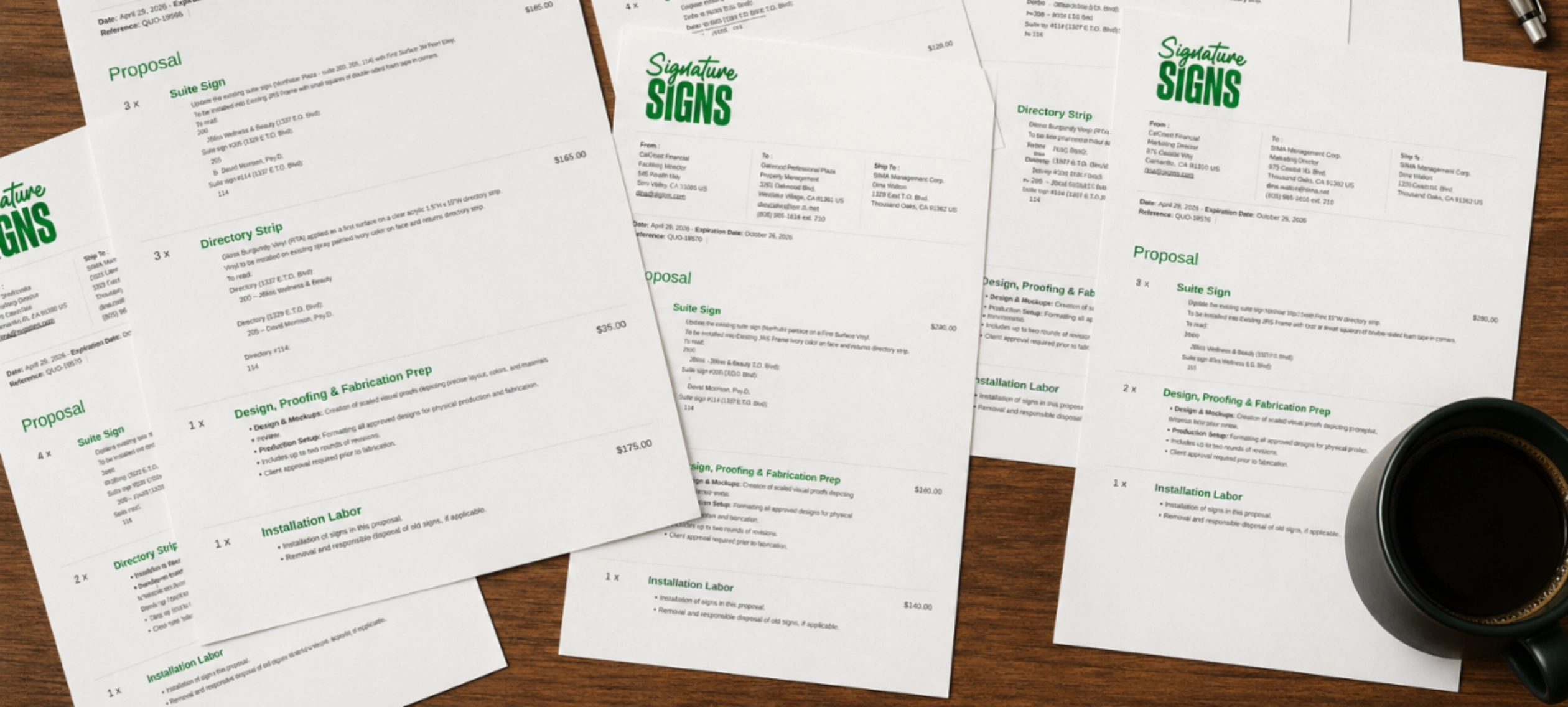
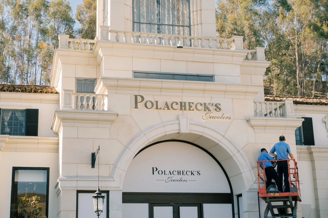
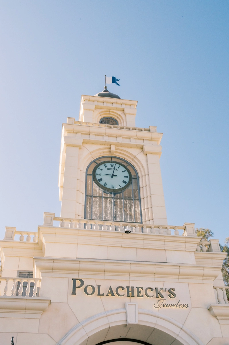
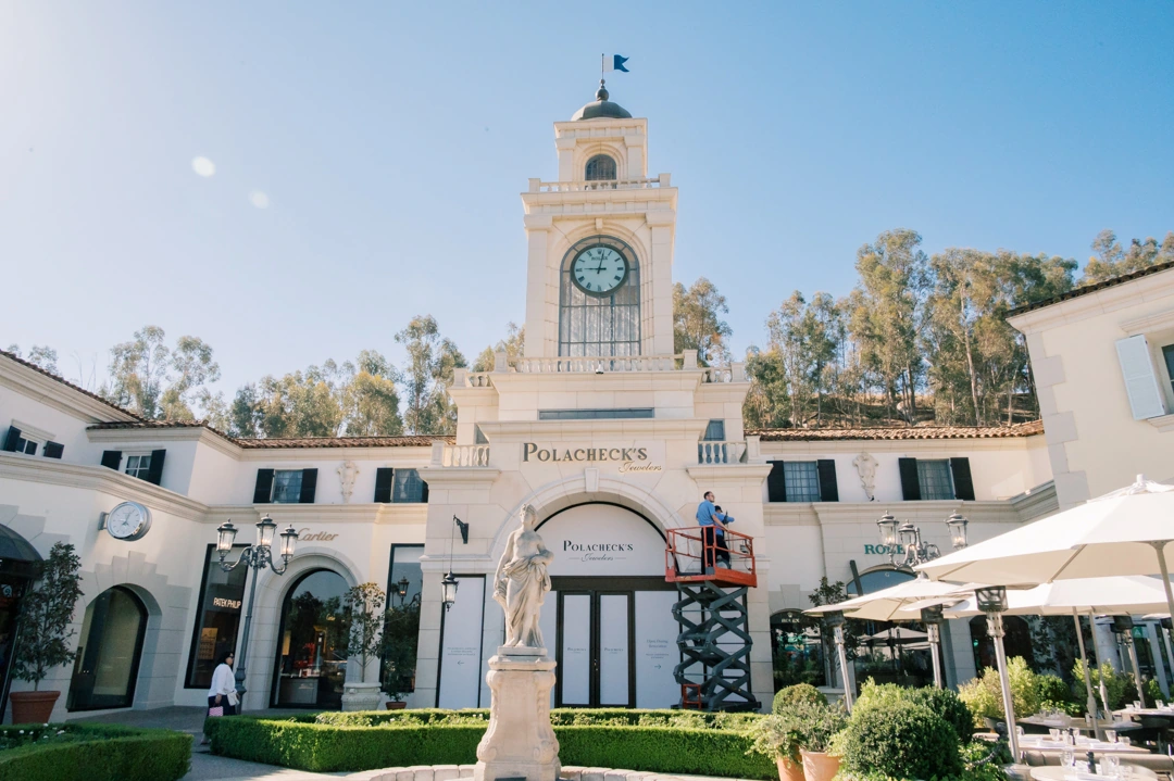
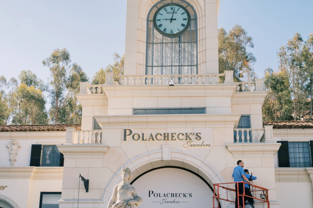
Polacheck’s Jewelers is located at The Commons at Calabasas, where the storefront sits within a highly detailed architectural setting defined by stone façades, arches, decorative molding, and the central clock tower. For this project, Signature Signs updated the primary storefront identification above the entrance while preserving the established visual character of the location.
Description & the Challenge
The existing storefront already carried the Polacheck’s Jewelers identity, so the project was not simply about introducing a new sign. The main challenge was replacing the primary Polacheck’s lettering while retaining and reinstalling the existing Jewelers script below it. Both elements had to read as a single composition despite being produced at different stages.
The architecture added another constraint. The sign occupies a prominent position directly above the main arched entrance and beneath several layers of architectural molding. The scale, spacing, projection, finish, and illumination therefore needed to work within a very specific area of the façade without overpowering the building itself.
The Solution
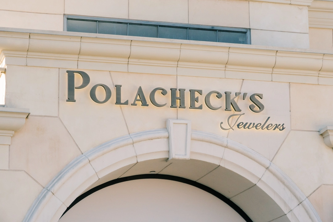
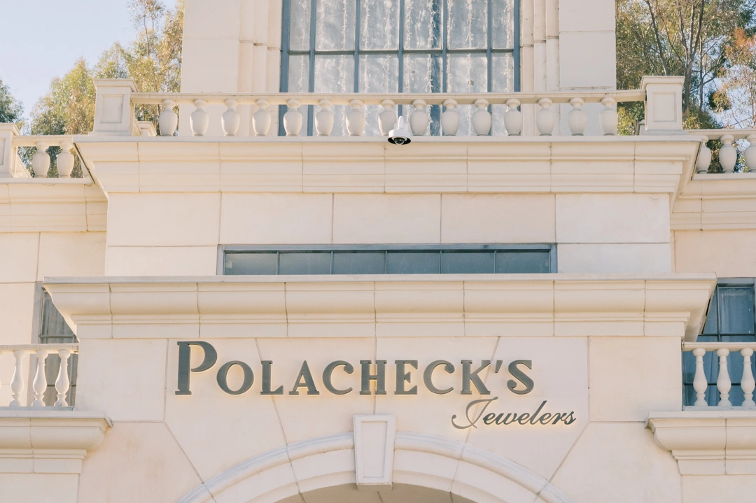
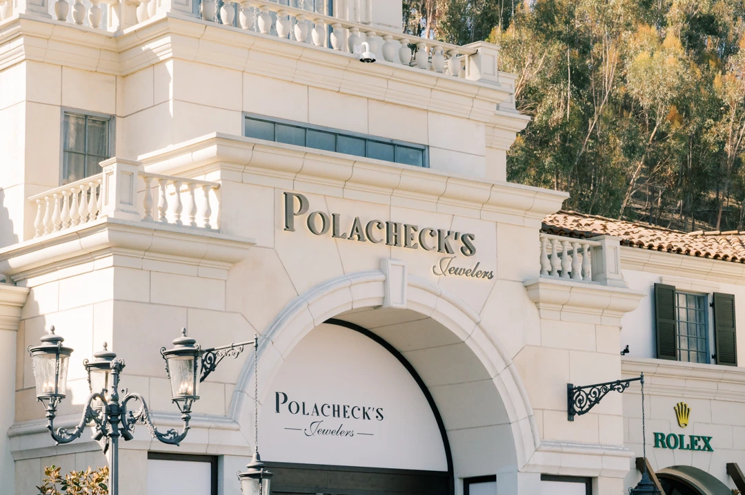
Signature Signs fabricated a new set of 3-inch-deep stainless steel pan channel letters for the Polacheck’s name. The letters received a Medium Bronze finish with a horizontal grain and were constructed with clear acrylic backs. Each letter was individually pin-mounted using one-inch aluminum spacers painted to match the building façade.
White LEDs installed inside the letters create halo illumination behind the copy, producing a controlled glow against the light stone surface. The existing Jewelers channel letters were retained and reinstalled beneath the new primary lettering, preserving the familiar script portion of the brand while updating the larger and more visually dominant name above it.
Design Considerations
The strongest part of this project is the relationship between the signage and the architecture. The Medium Bronze finish provides enough contrast against the cream façade during the day without introducing a harsh color into the building’s restrained palette. At night, the rear illumination adds visibility while keeping the faces of the letters visually clean.
Spacing was equally important. The Polacheck’s lettering spans approximately 112.6 inches, while the existing Jewelers script occupies a smaller area beneath it. Their different type styles, proportions, and sizes had to remain visually connected without losing the hierarchy between the main brand name and secondary descriptor.
The Impact
The completed sign gives the storefront stronger dimensional definition while remaining consistent with the character of The Commons at Calabasas. During daylight hours, the bronze-finished letters create a refined contrast against the façade. After dark, the halo lighting separates the lettering from the wall and improves identification without introducing exposed lighting elements or an overly bright sign face.
Because the existing Jewelers copy was incorporated rather than replaced unnecessarily, the finished installation also maintains continuity with the previous storefront identity while giving the primary signage a cleaner and more substantial presence.
Key Benefits
- Custom 3-inch-deep stainless steel pan channel letters
- Medium Bronze finish with horizontal grain
- Clear acrylic backs for controlled halo illumination
- White LED illumination at no more than 3500K
- Individual pin mounting with one-inch spacers
- Reuse and integration of the existing Jewelers lettering
- Improved nighttime visibility without exposed illumination
- Sign proportions developed specifically for the existing architectural façade
Closing
This project required more than replacing a set of storefront letters. The new signage had to work with an existing brand element, a highly detailed façade, and a prominent entrance location. The combination of bronze-finished dimensional letters, concealed LED illumination, precise mounting, and the retained Jewelers script creates an updated storefront identity that feels integrated with the building rather than added on top of it.