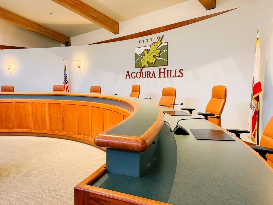
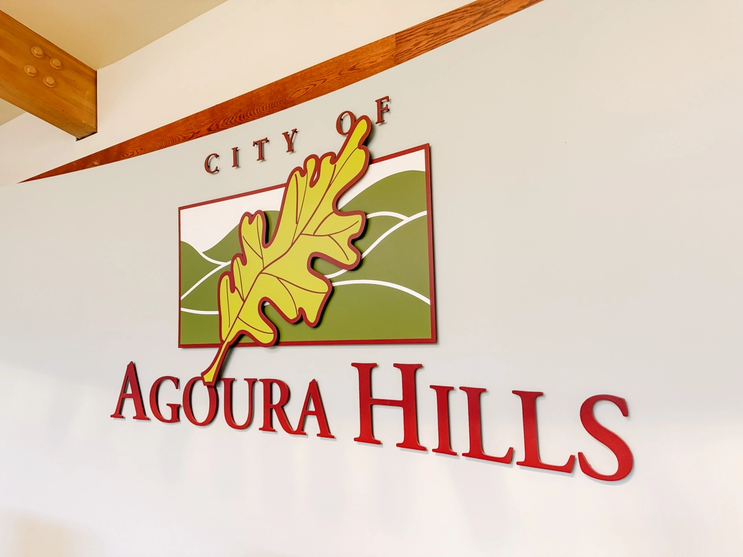
The City of Agoura Hills commissioned Signature Signs to create a dimensional version of its official city logo for the City Council Chamber at 30001 Ladyface Court. Positioned directly behind the council dais, the installation serves as a permanent visual identifier within one of the city’s primary public meeting spaces.
Description & the Challenge
Unlike conventional office signage, a municipal council chamber requires a more restrained approach. The logo needed to reproduce the city’s established identity accurately while working at an architectural scale and remaining appropriate for a formal civic environment. Its placement on a large wall behind the council seating also meant that proportion, spacing, depth, and visibility had to be considered from multiple points throughout the room.
The project extended beyond the main logo itself. The surrounding presentation included existing photo frames and individual title plaques identifying the Mayor, Mayor Pro Tem, and Councilmembers, so the new signage needed to function as part of a larger, organized wall composition rather than as an isolated graphic element.
The Solution
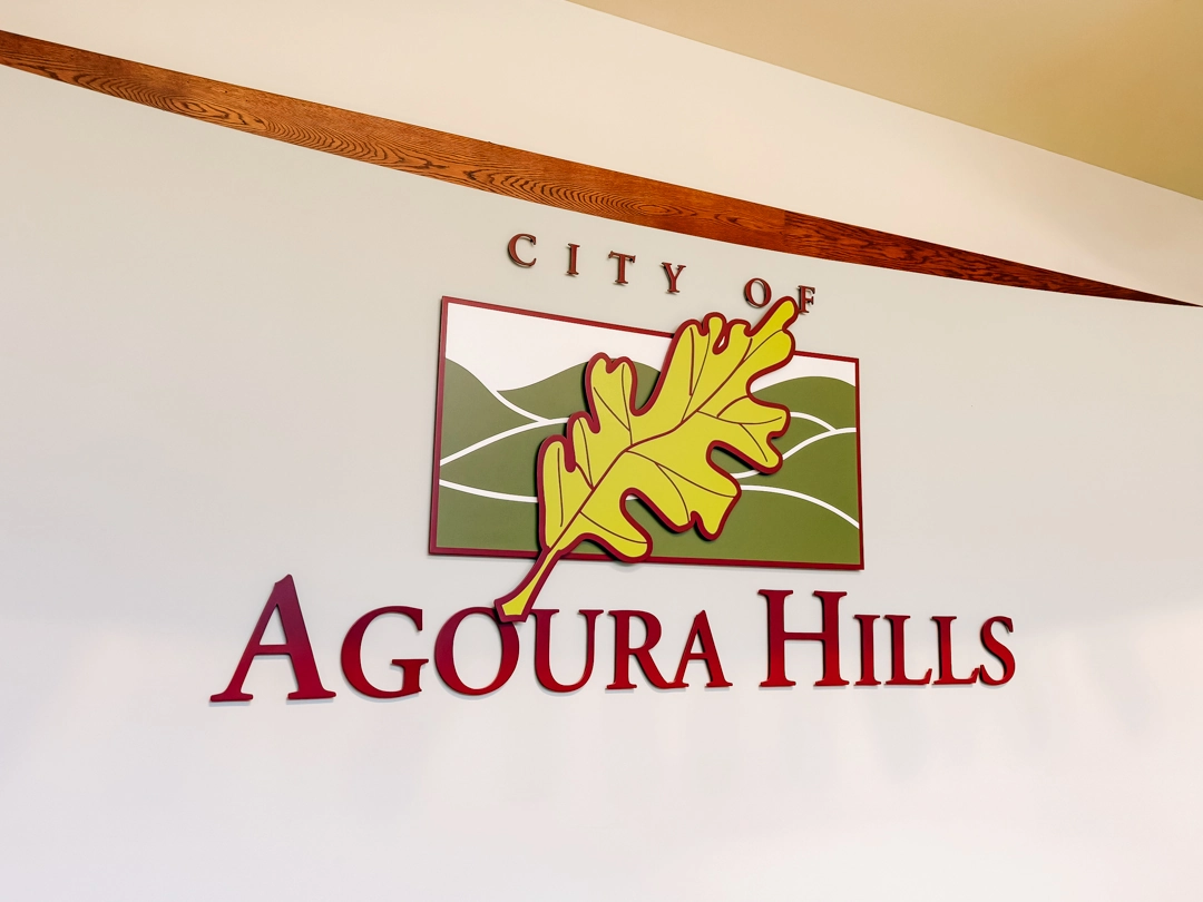
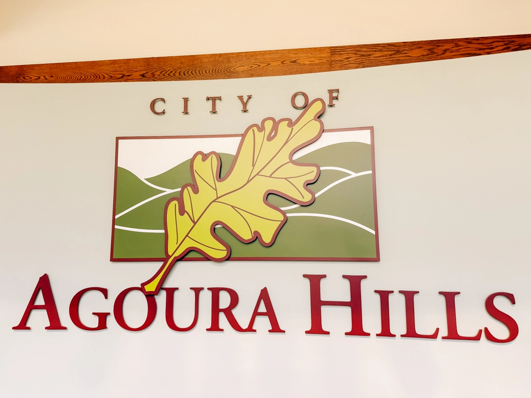
Signature Signs developed a dimensional interpretation of the City of Agoura Hills logo using 0.25-inch-thick aluminum components painted to match the established city colors. Individual elements were stud-mounted flush to the wall, allowing the leaf, landscape graphic, and lettering to retain their distinct shapes and dimensional definition without introducing unnecessary visual bulk.
The completed logo measures approximately 31.25 inches wide by 16 inches high. Its layered construction gives the graphic physical depth while preserving the proportions and recognizable details of the original city identity. Complementary precision-tooled title plaques were also developed for the council display, creating a consistent presentation across the wall.
Design Considerations
The main consideration was translating a multi-element graphic identity into dimensional signage without losing clarity. The large oak leaf crosses several areas of the background graphic and lettering, while the smaller “CITY OF” typography requires considerably finer spacing than the main “AGOURA HILLS” lettering. Each component therefore had to be fabricated and positioned as part of one coordinated composition.
Material and finish were equally important. Aluminum provides the clean edges and controlled depth required for this type of dimensional installation, while the custom painted finishes maintain the red, green, yellow, and neutral tones of the city identity. Flush mounting keeps the installation visually integrated with the chamber rather than making it appear as a separate sign panel.
The Impact
The finished installation establishes a clear civic identity within the council chamber while remaining consistent with the room’s existing architecture. From the council dais to wider views of the chamber, the logo remains readable and visually balanced without competing with the woodwork, flags, seating, and other formal elements of the space.
Its dimensional construction also gives the identity greater presence than a flat wall graphic would provide. Subtle depth and shadow define the individual components while maintaining the restrained appearance appropriate for a municipal setting.
Key Benefits
- Accurate dimensional reproduction of the official City of Agoura Hills identity
- Custom-painted 0.25-inch aluminum construction
- Clean stud-mounted installation with minimal visible hardware
- Proportions developed specifically for the council chamber wall
- Coordinated title plaques for Mayor, Mayor Pro Tem, and Councilmember positions
- Durable construction suitable for a permanent civic interior
- Clear visibility throughout the council chamber
This project demonstrates how dimensional signage can bring an established municipal identity into an architectural environment without changing the character of the original design. Through controlled fabrication, accurate color reproduction, careful spacing, and a clean installation, the City of Agoura Hills logo becomes an integrated part of the council chamber rather than simply a graphic applied to the wall.