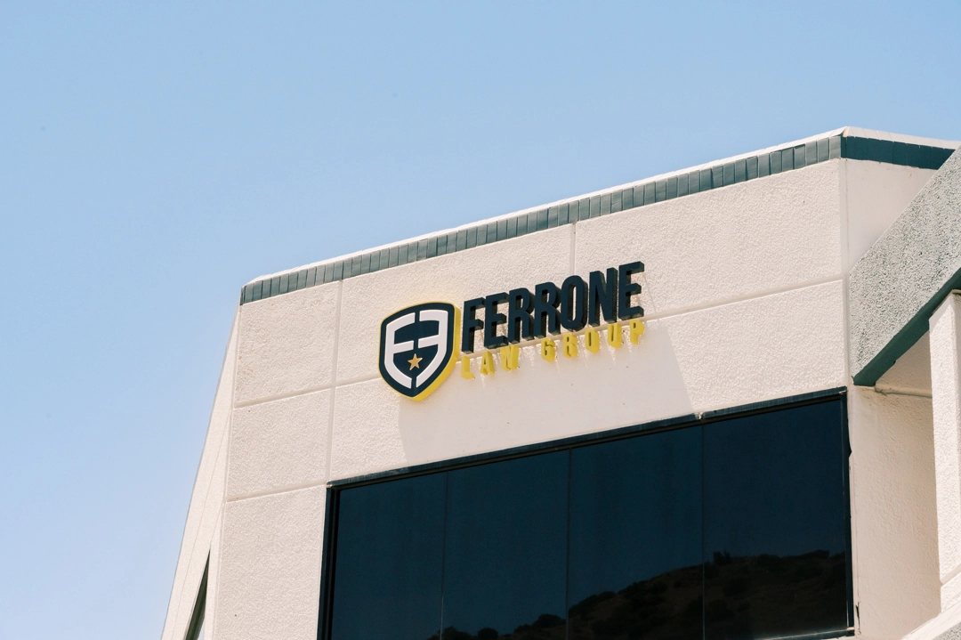
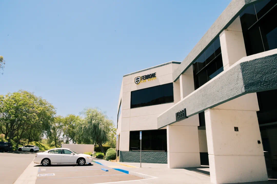
Ferrone Law Group needed exterior building signage for its Westlake Village office that would clearly establish the firm’s identity on a large commercial façade. Positioned high above the building’s dark window line, the sign needed enough scale and contrast to remain recognizable from the parking area and surrounding approach.
Description & the Challenge
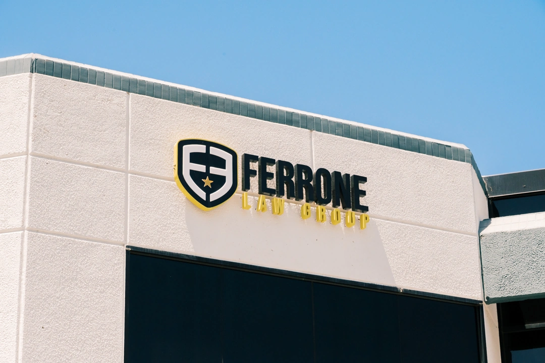
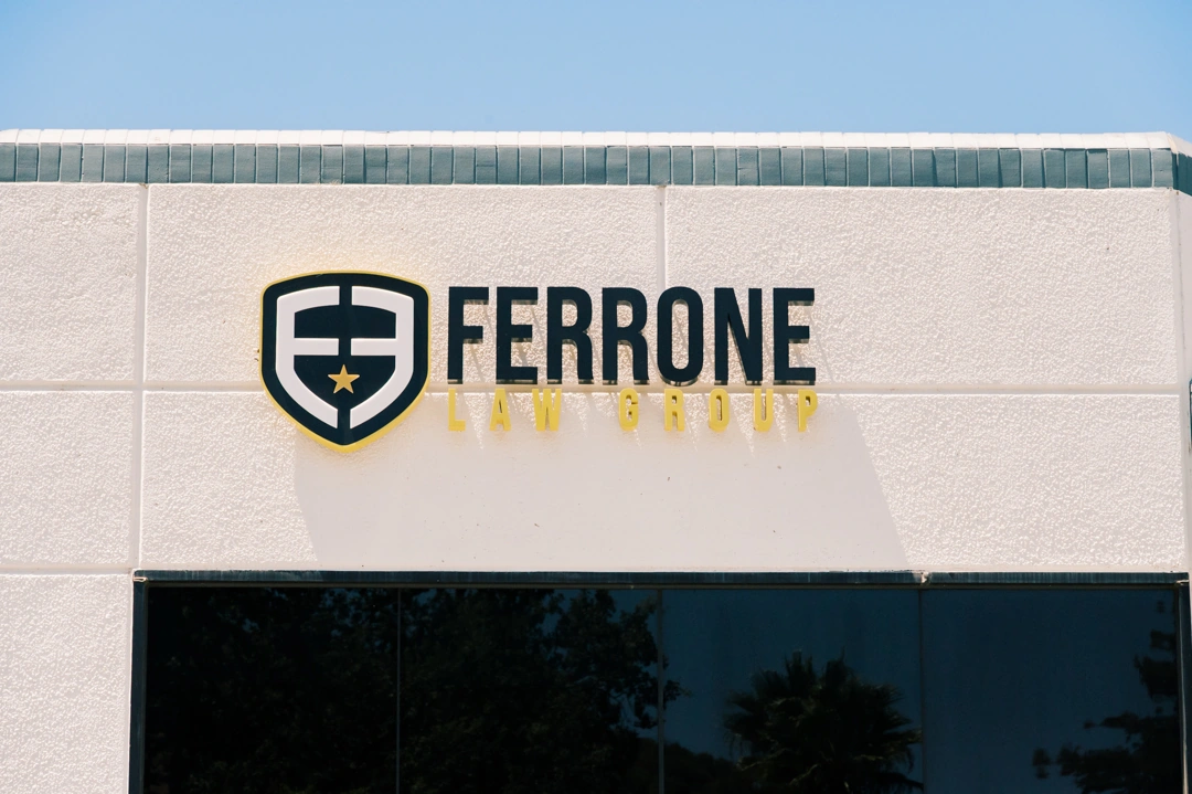
The Ferrone Law Group identity combines several visually distinct elements: a shield logo, bold black Ferrone lettering, and smaller gold Law Group copy. Translating that composition into dimensional exterior signage required maintaining the hierarchy of the original branding while ensuring that each component remained legible at building scale.
The light textured façade also created an opportunity to use depth, shadow, and illumination rather than relying only on color contrast. At the same time, the complete sign needed to fit within a relatively defined section of the upper façade without appearing undersized against the overall building.
The Solution
Signature Signs fabricated the shield as a 3-inch-deep aluminum channel logo with black and PMS 7752C finishes. The logo incorporates routed faces with 0.75-inch push-through acrylic elements and a 3M vinyl overlay.
The lettering was fabricated as 3-inch-deep aluminum pan channel letters using Satin Black and PMS 7752C finishes. White LEDs provide internal illumination, while the dimensional construction and spacing from the façade create additional visual separation between the sign and the building surface. The complete composition measures approximately 98.5 inches wide, with the shield reaching approximately 34 inches in height.
Design Considerations
The contrast between black, gold, white, and the light-colored façade is central to the design. The black Ferrone lettering carries the strongest visual weight, while the gold Law Group line introduces a secondary level of information without competing with the main name.
The shield functions as both a brand identifier and a visual anchor for the composition. Its dimensional construction, push-through acrylic details, and illumination give the logo additional depth while preserving the geometry of the original mark.
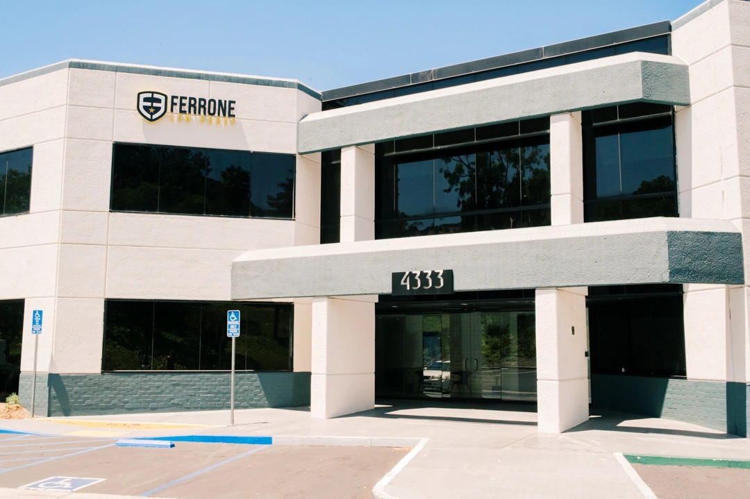
Placement was also important. Installing the sign above the upper window line gives it an unobstructed field against the building and allows the logo and lettering to be read together from a distance.
The Impact
The finished installation gives Ferrone Law Group a clearly defined exterior presence while working with the existing architecture rather than dominating it. From wider views of the property, the sign provides an immediate point of identification on an otherwise restrained commercial façade.
At closer range, the dimensional construction, contrasting finishes, and detailed shield become more visible. The integrated illumination extends that visibility beyond daylight hours while maintaining the same brand hierarchy established by the daytime appearance.
Key Benefits
- Custom 3-inch-deep aluminum channel logo
- 3-inch-deep aluminum pan channel lettering
- Face and halo illumination
- Integrated white LED lighting
- Push-through acrylic logo details
- Satin Black, PMS 7752C, white, and Gold Nugget finishes
- Dimensional mounting for added depth and separation
- High façade placement for stronger building identification
- Brand colors and proportions carried consistently into architectural signage
For Ferrone Law Group, the signage needed to translate a compact graphic identity into a format that could perform at architectural scale. The combination of dimensional fabrication, contrasting finishes, integrated illumination, and carefully balanced logo and lettering proportions creates a sign that remains recognizable both from across the property and at close range.