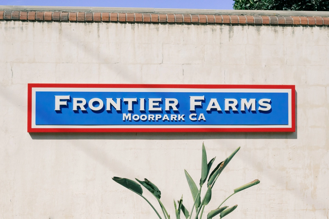
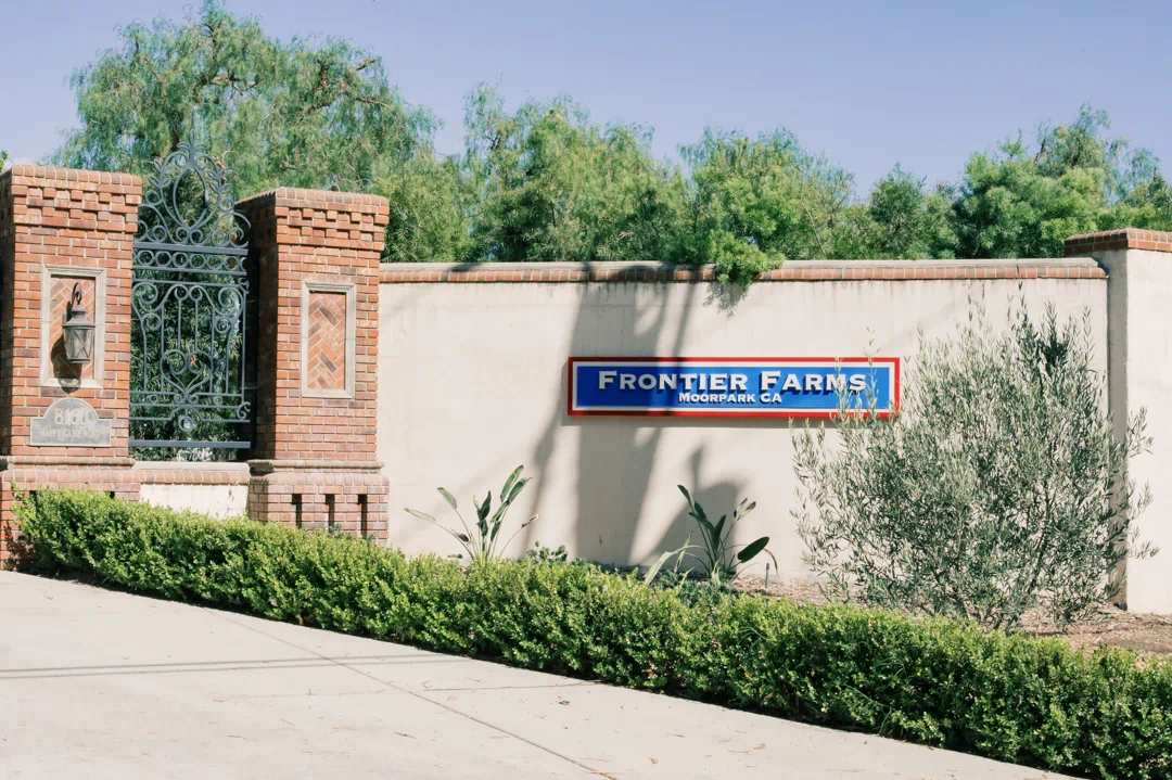
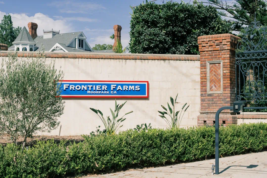
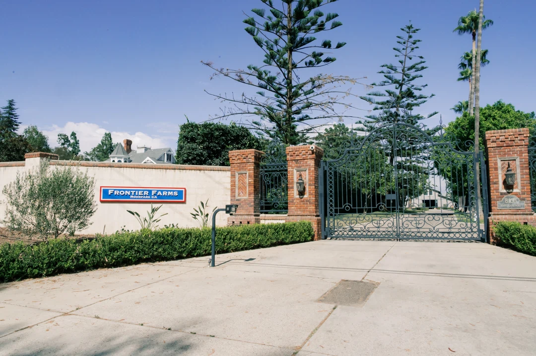
Frontier Farms required new exterior identification signage for its property in Moorpark, California. The project included two matching non-illuminated signs installed on the existing perimeter walls near the property entrance. The objective was to establish clear property identification while developing signage that would work naturally with the existing masonry, brick architectural details, entrance gates, and surrounding landscaping.
Description & the Challenge
The primary challenge was to introduce a strong visual identifier within an established architectural setting. The signs are positioned on light-colored masonry walls framed by brick columns, mature landscaping, and ornamental entrance gates. With several materials and architectural elements already present, the signage needed sufficient contrast and dimensionality to remain clearly visible without appearing disconnected from the property.
Visibility and information hierarchy were equally important. “Frontier Farms” needed to function as the dominant element and remain easy to recognize from the approach to the entrance, while “Moorpark CA” served as secondary information. The relatively long horizontal wall areas also required proportions that would provide adequate presence without making the signs appear oversized in relation to the surrounding architecture.
The Solution
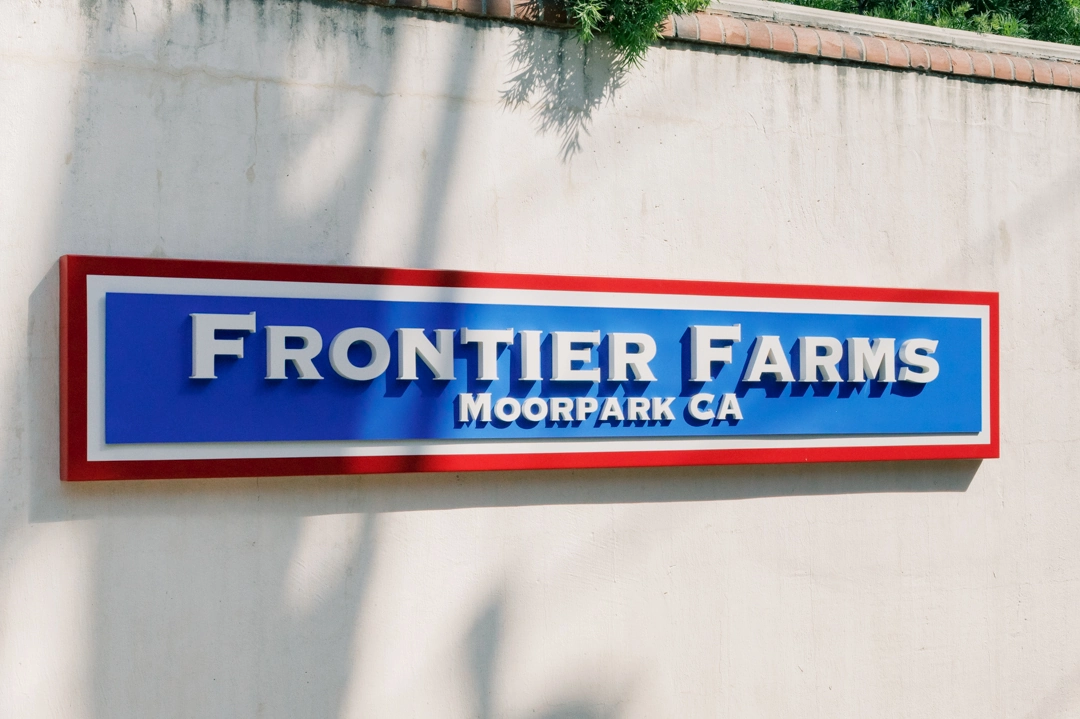
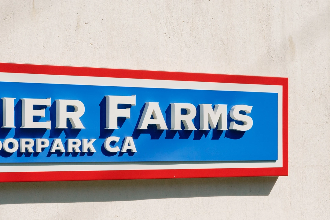
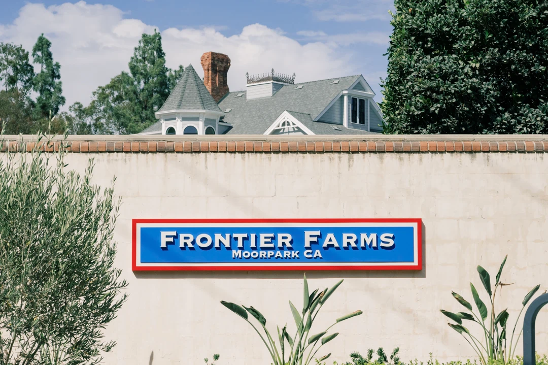
Signature Signs developed two matching wall-mounted, non-illuminated signs using a layered construction. Each sign incorporates a fabricated aluminum pan approximately two inches deep, a blue acrylic background section, contrasting perimeter details, and dimensional acrylic lettering. The larger “Frontier Farms” lettering forms the primary identification, with the smaller “Moorpark CA” copy positioned beneath it as a secondary element.
Rather than relying on illumination, the design uses material depth, color contrast, and dimensional lettering to create visibility. The raised letters project from the sign face and produce natural shadowing throughout the day, adding definition to the typography and giving the finished signs considerably more visual depth than a flat panel or printed graphic.
Design Considerations
Proportion and hierarchy were central to the design. The horizontal format corresponds with the available wall area and provides sufficient width for the Frontier Farms name without compressing the typography. The primary lettering is substantially larger and deeper than the location copy, establishing an immediate distinction between the main property identification and supporting information.
The color composition also plays an important functional role. The blue central field provides a strong background for the light dimensional lettering, while the red perimeter and contrasting inner border clearly define the overall sign shape against the neutral masonry. These elements allow the signs to remain visually distinct even within a property that already contains brickwork, decorative gates, vegetation, and other architectural details.
Material depth was used deliberately rather than decoratively. The dimensional construction creates physical separation between the lettering and background, improving definition under natural light while maintaining the straightforward character appropriate for a non-illuminated exterior identification sign.
The Impact
The completed signage gives Frontier Farms a clearly defined presence at the property entrance. Against the existing light masonry walls, the blue and red sign faces establish immediate contrast, while the dimensional lettering remains visually distinct under different daylight conditions.
Using two matching signs also creates consistent identification across the entrance area. Instead of introducing a new freestanding structure or altering the existing architectural features, the signage works with the available wall surfaces and becomes part of the established entrance composition. The result is a balanced exterior identification system that is visually recognizable without overwhelming the surrounding property.
Key Benefits
- Two coordinated exterior identification signs
- Dimensional acrylic lettering for greater depth and definition
- Strong contrast against the existing light-colored masonry
- Clear hierarchy between the Frontier Farms name and location information
- Non-illuminated construction designed around natural visibility
- Horizontal proportions suited to the existing perimeter walls
- Consistent identification across the property entrance
- Integration with the existing architecture and landscaping
The Frontier Farms project demonstrates how a relatively straightforward exterior sign can provide effective property identification when proportion, material depth, contrast, and placement are considered together. By working with the existing perimeter walls and architectural character of the entrance, the completed signage establishes a clear Frontier Farms identity while remaining appropriately integrated with the surrounding property.