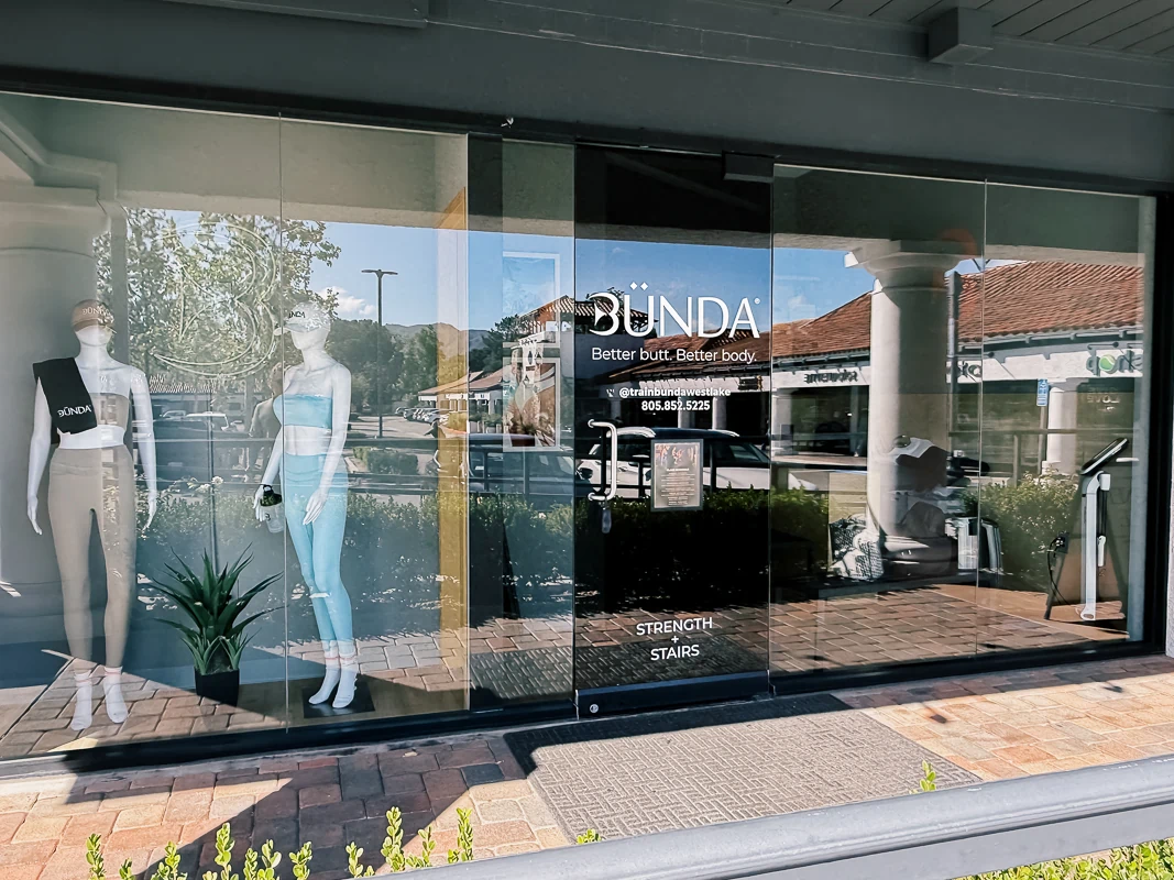
Bunda is a boutique fitness studio with a focused brand identity built around simplicity, control, and consistency. Located in Thousand Oaks within a multi-tenant retail strip, the storefront relies on clear, restrained signage rather than scale or visual noise to stand out.
Description & the Challenge
The challenge was not visibility alone, but how to achieve it without relying on illumination or high contrast. In a typical retail setting, neighboring signage often competes through brightness, color, or size. This project required the opposite approach.
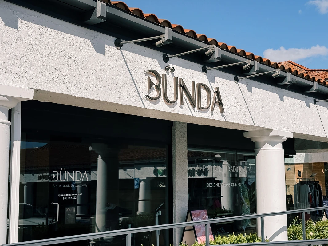
The sign needed to remain readable from a distance while fitting within an existing façade that included a tiled roofline, structural beams, and pre-installed lighting fixtures. Placement and proportion were critical. Any misalignment would immediately break the visual balance across the storefront.
At the same time, the brand itself called for restraint. The signage had to feel intentional and controlled, not loud or overly commercial.
The Solution
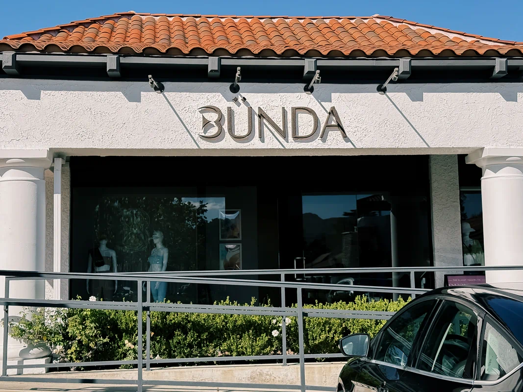
We fabricated and installed a non-illuminated dimensional letter sign using 1.5” thick HDU letters, mounted flush to the wall. The letters were finished in a textured paint, allowing natural light to create subtle variation across the surface throughout the day.
The composition was centered within the available fascia, aligning with both the storefront and adjacent tenants to maintain visual continuity across the building.
According to the project specification, the lettering spans approximately 72 inches in width and is mounted using a flush installation method with adhesive systems to avoid visible hardware.
Design Considerations
Without illumination, depth becomes the primary tool for visibility. The thickness of the letters creates natural shadow lines, helping the sign read clearly under changing light conditions.
Material and finish were selected to avoid flatness. The textured surface reduces glare and reflection while adding enough variation to keep the sign visually active without making it decorative.
The mounting method was kept clean and minimal. By eliminating visible fasteners, the sign maintains a controlled and cohesive appearance that aligns with the brand’s direction.
The surrounding architecture also played a role. Existing overhead fixtures and structural elements required precise spacing to ensure the sign sits comfortably within the façade rather than competing with it.
The Impact
The storefront now reads as a defined, intentional location rather than another unit within a retail strip. The sign does not rely on brightness to attract attention. Instead, it holds its presence through proportion, material, and placement.
From a distance, the name remains legible for passing traffic. Up close, the depth and finish provide enough detail to reinforce the brand without overcomplicating it.
Key Benefits
- Clear storefront identification without the need for illumination
- Dimensional HDU letters creating depth and readability
- Clean, flush-mounted installation with no visible hardware
- Balanced integration with existing architecture
- Controlled visual presence aligned with brand positioning
This project works through restraint. Instead of competing with the surrounding signage, it establishes presence through clarity, proportion, and material.


.webp)