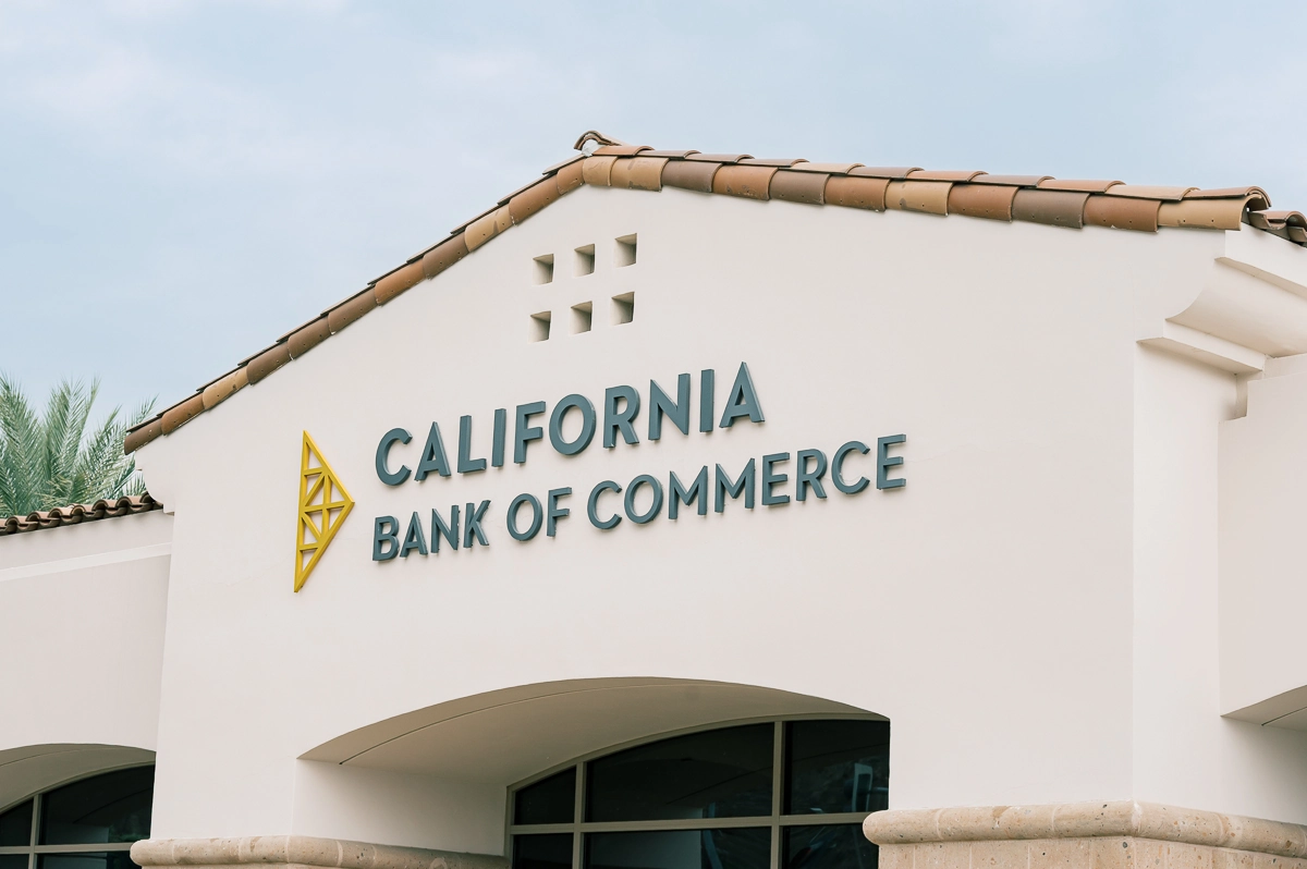
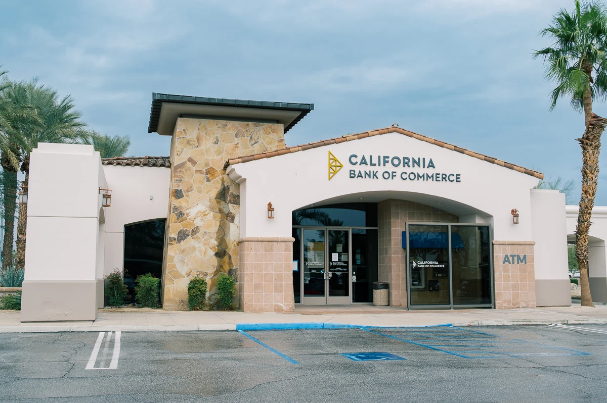
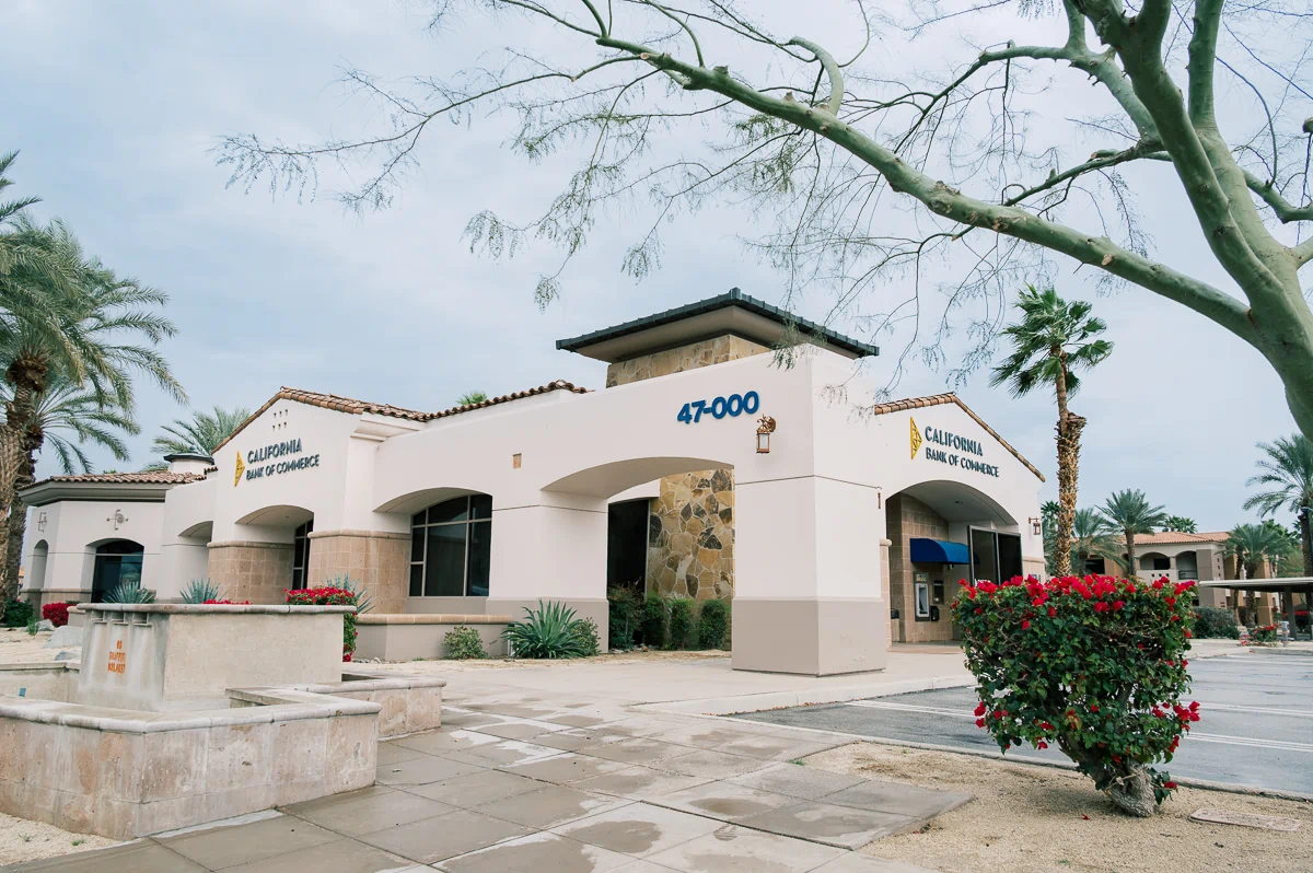
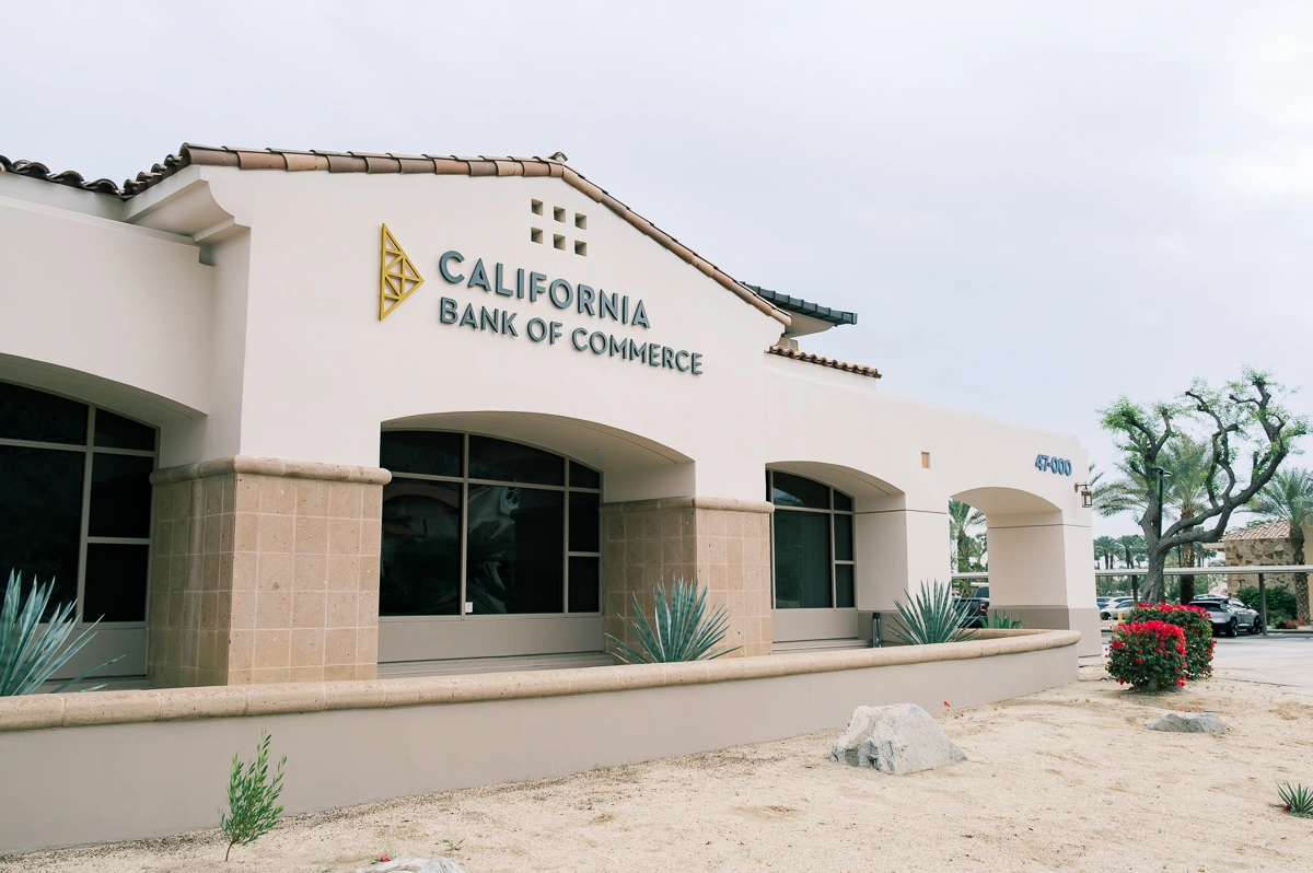
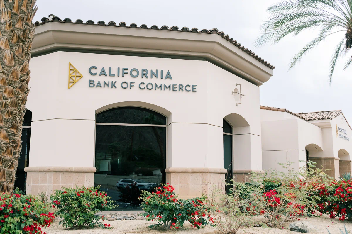
For this California Bank of Commerce branch in La Quinta, the architecture does a lot of the talking. With its heavy stone pillars, warm stucco, and deep arched entryways, the building has a very specific "high-end desert" feel. Our task was to get the bank’s branding onto the building in a way that felt like it was part of the original masonry, not just an add-on.
The Challenge: Visibility Without the Glow
The main constraint was the client’s move toward non-illuminated signage. When you aren't using LEDs to create contrast at night, you have to be much more strategic about where you place things and how big they are. We had to ensure the brand was legible against both the textured stone and the smooth stucco elevations, all while navigating the building's curved walls and varying heights.
The Solution: Dimensional Fabricated Signage
We designed and installed a series of large-scale dimensional letters and logos across the building’s primary elevations.
Rather than a "one size fits all" approach, we scaled the signs to fit their specific sections of the wall.
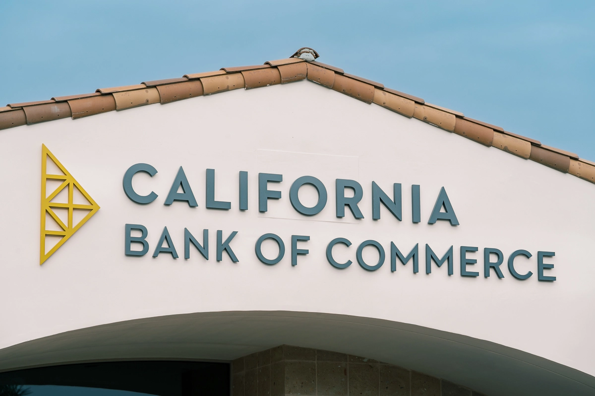
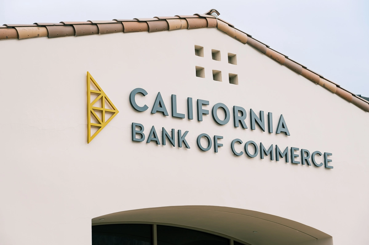
- On the stone towers: We used clean, light-toned lettering that stands out against the darker, textured rock.
- On the curved facades: We adjusted the mounting and spacing to ensure the "California Bank of Commerce" wordmark followed the building's geometry without looking distorted.
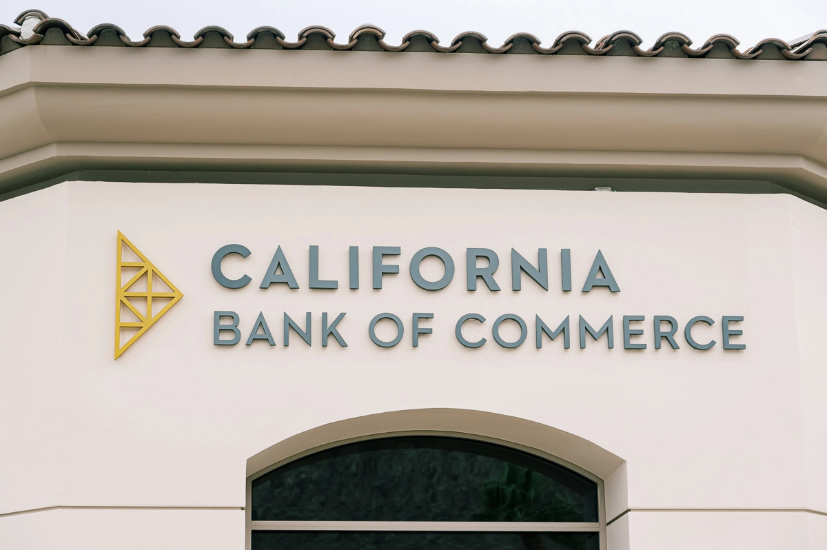
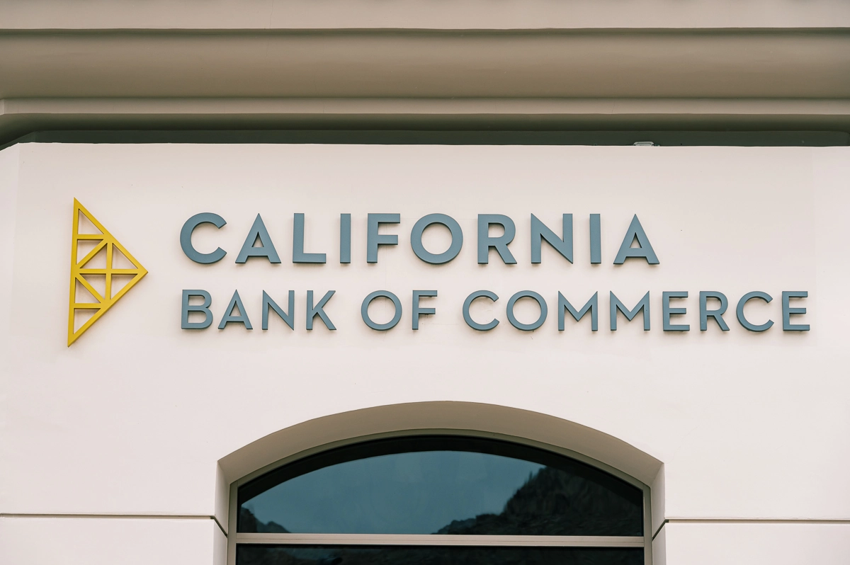
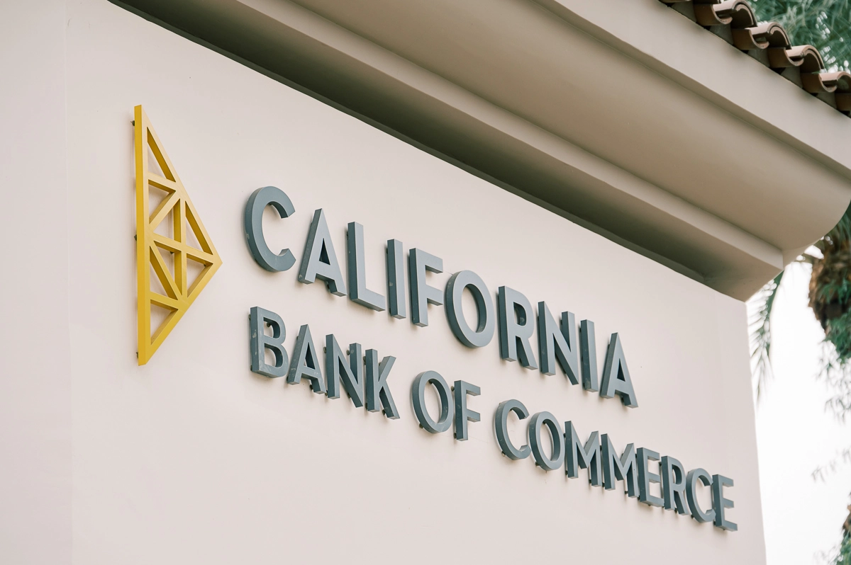
- The Build: These are fabricated dimensional letters, providing a deep profile that creates a natural shadow line—essential for readability in the bright La Quinta sun.
Design Considerations
Without internal lighting, the "pop" comes from depth and shadow. By using deep-profile letters, the sun effectively becomes the light source, creating a 3D effect that changes slightly throughout the day. We also paid close attention to the architectural "grid" of the building. We aligned the signs with the center points of the arches and the horizontal lines of the stone accents so the final result looks balanced and intentional.
The Impact
The bank now has a clear, authoritative presence on the street. The signage is large enough to be functional for wayfinding but subtle enough to respect the building's design. It proves that you don't need bright lights to make a statement—you just need the right scale and high-contrast materials.
Key Benefits
- Architectural Harmony: The signs sit within the building’s "frames" (arches and towers) rather than overlapping them.
- Sun-Driven Readability: Deep-dimensional letters use natural light to create high-contrast shadows for daytime reading.
- Multi-Surface Mounting: Custom installations on both curved stucco and flat stone surfaces.
- Low-Profile Maintenance: A durable, non-electrical solution that looks premium without the upkeep of lighting.
By treating the building as a canvas rather than just a mounting surface, we were able to give the bank a permanent, integrated look that fits the local La Quinta landscape perfectly.


.webp)