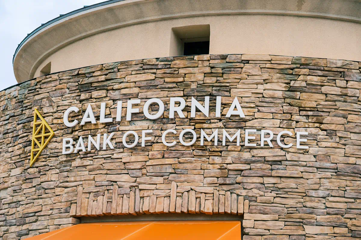
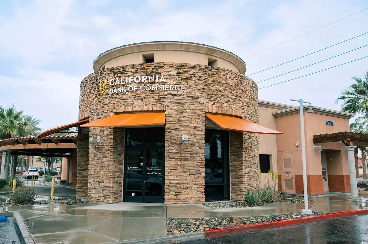
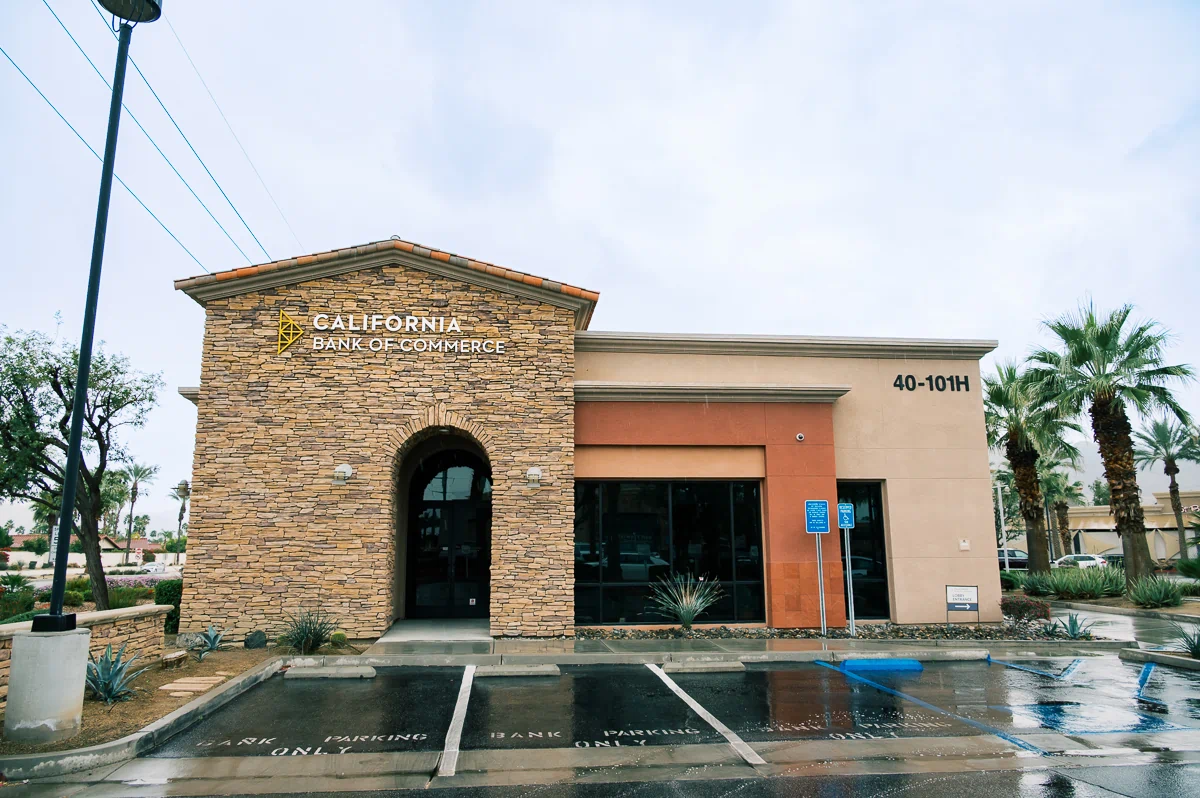
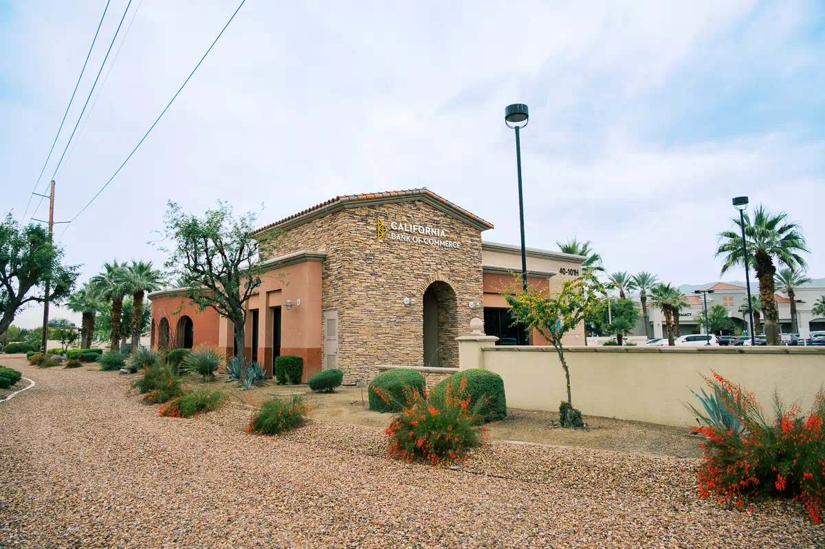
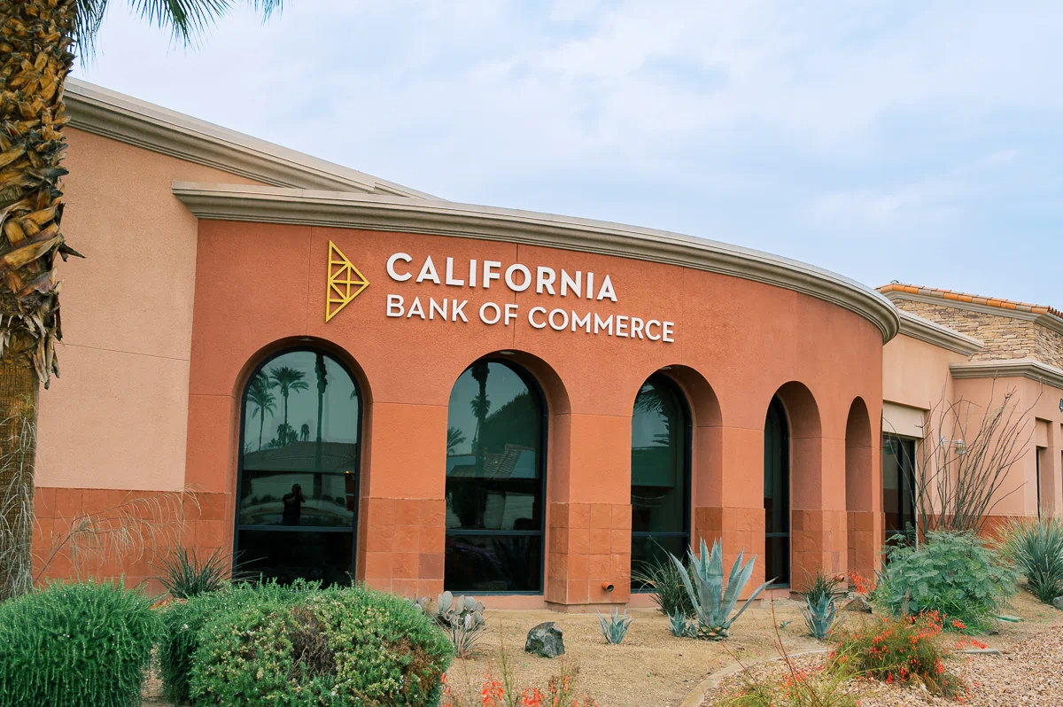
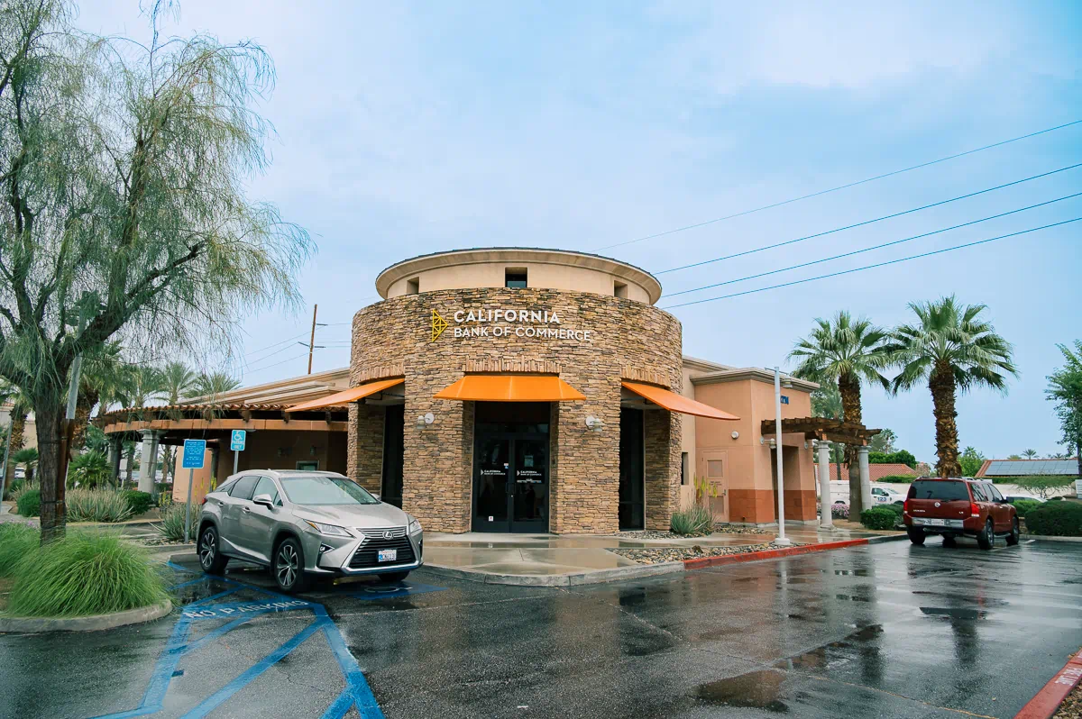
This branch for California Bank of Commerce is located at 40101 Monterey Ave in Rancho Mirage. It’s a building with a lot of personality—heavy stone cladding, stucco, and distinct arches—which meant the signage had to be handled carefully to avoid clashing with the desert-inspired architecture.
The Challenge
The main goal was to make the bank easy to find without letting the signs take over the building’s design. Because the exterior features both textured stone and smooth stucco, we couldn't just "stick a sign on it" and call it a day. We had to find a way to keep the branding legible against these busy textures while making sure the placement felt natural on both the flat walls and the curved elevations.
The Solution
We settled on a system of dimensional building signs that wrap around multiple sides of the property. Rather than one massive logo, we installed a coordinated set:
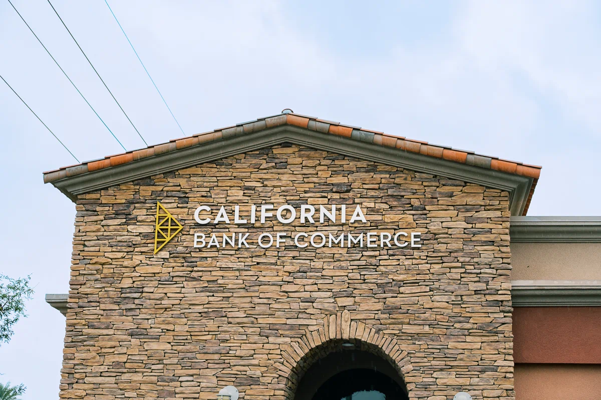
- Primary ID: Placed high on the stone tower for long-range visibility.
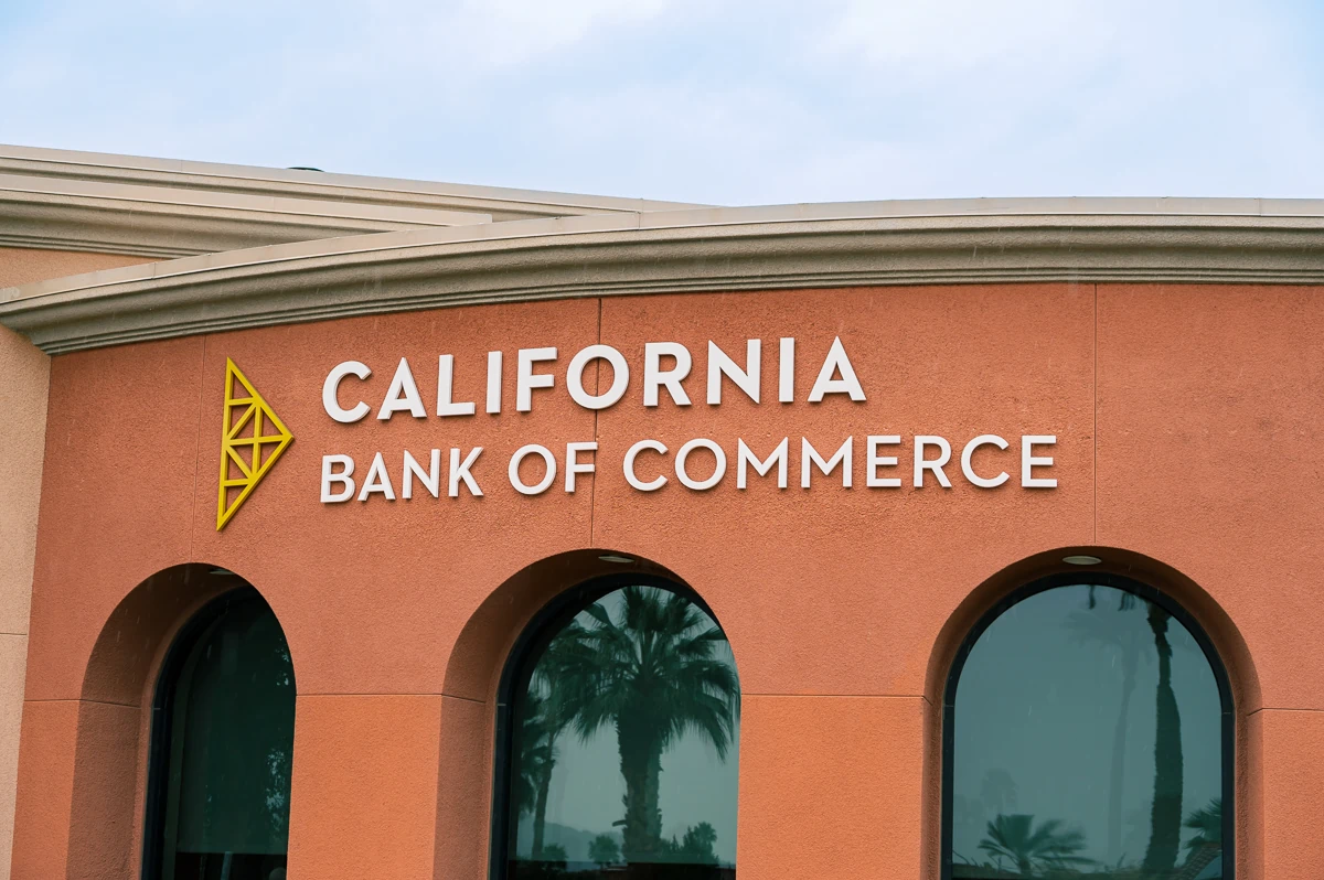
- Secondary Signs: Mounted on adjacent elevations to catch traffic from different angles.
- Material Mix: The logo and lettering are a combination of painted acrylic and aluminum. These are stud-mounted with a slight offset from the wall, adding a bit of depth.
Per the client's preference, the entire system is non-illuminated. It relies on clean contrast and shadows to do the work rather than internal lights.
Design Considerations
Since we weren't using light, visibility came down to two things: contrast and depth. The light-colored lettering pops against the darker stone and the earth-toned stucco. By using dimensional letters, the sun creates natural shadows that shift throughout the day, which actually helps the legibility in the bright California sun. We also varied the size of the signs depending on the wall they were sitting on, so nothing feels too cramped or too small for its specific spot.
The Impact
The bank is now easy to spot from the street and the parking areas, but the signs feel like they belong to the building. It’s a clean, professional look that fits the "quiet" confidence a financial institution usually wants to project. The architecture still does the heavy lifting, and the signage provides the necessary clarity.
Key Benefits
- Multi-angle visibility: The bank is identifiable from all surrounding approach points.
- Architectural fit: The materials and mounting style complement the stone and stucco instead of covering them up.
- Natural contrast: Dimensional depth provides readability during daylight hours without the need for power.
- Scaled proportions: Each sign was sized specifically for the wall it occupies.
The project shows that you don't always need bright lights or oversized Cabinets to make an impact; sometimes, just getting the placement and the materials right is enough to make a building stand out.


.webp)