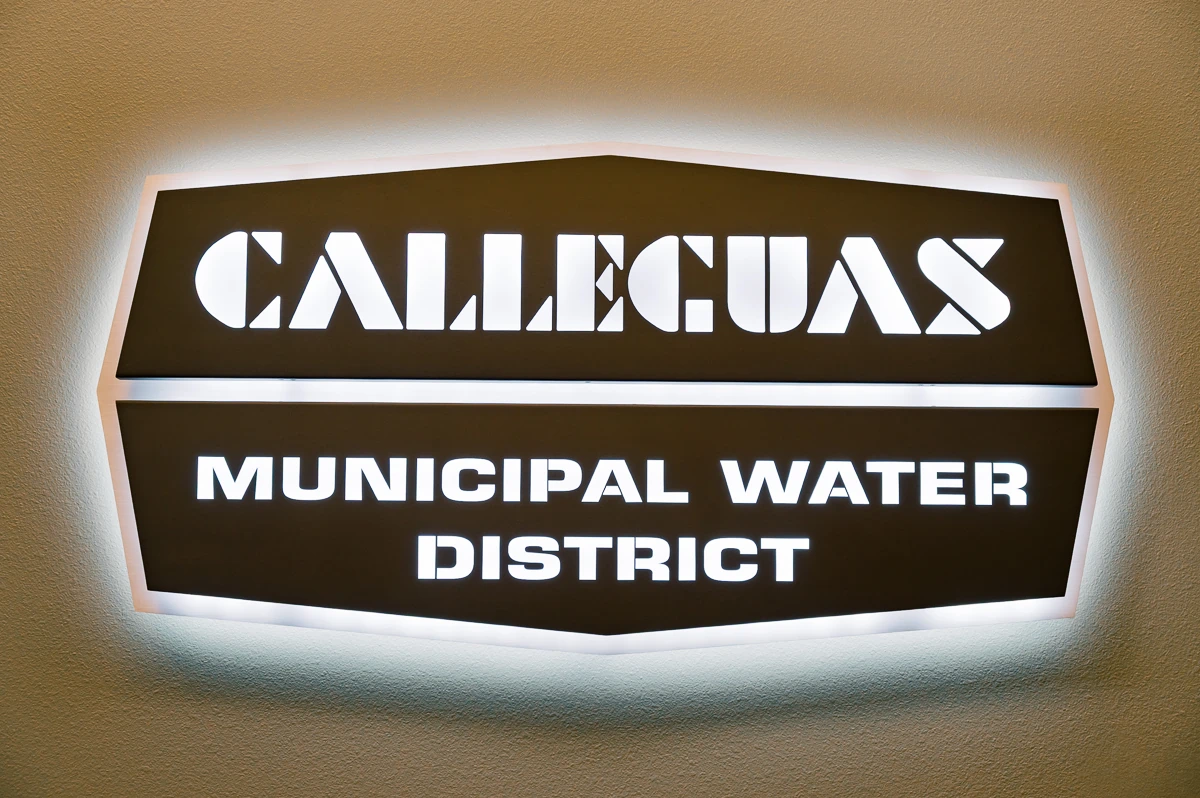
Calleguas Municipal Water District is a public agency serving communities across the region, so the sign needed to feel official, stable, and permanent from the first glance. This was not a decorative office piece or a branded wall accent made just to fill space. It had to identify the organization clearly inside the building, hold up visually in a civic setting, and bring a stronger sense of finish to the interior.
Description & the Challenge
The challenge was in the balance. The sign needed enough presence to read as a main identification element, but it also had to sit comfortably within a formal interior with warm wood paneling, neutral walls, and a restrained architectural palette. A flat panel would have looked too plain and too administrative. Something louder or more theatrical would have felt out of place for a municipal client. The solution had to land in the middle: clear, solid, and professional, with enough depth and light to give the wall a focal point without making the environment feel commercial.
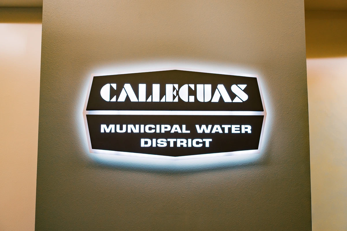
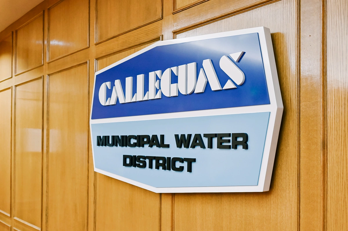
Another part of the challenge was the construction itself. The sign was not simply surface-applied lettering. It had to be built as a dimensional object with layered components, clean edge conditions, and controlled illumination. That meant the design had to work not only from the front, but also in profile, because the depth, offset, and light spread would all affect the final read on the wall.
The Solution
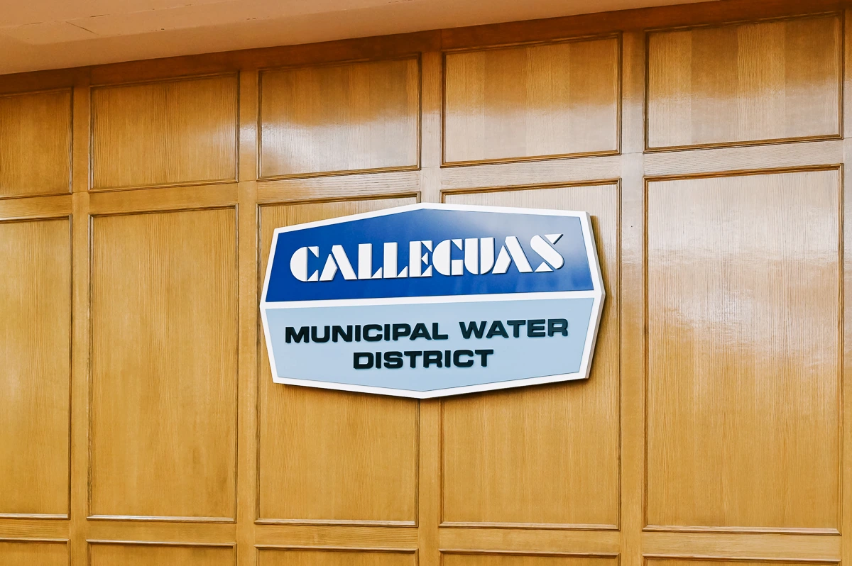
We designed, fabricated, and installed a custom illuminated interior dimensional sign for the district, using a layered construction that gives the piece both clarity and visual weight. The overall form separates the district name into two stacked sections, which helps the information read quickly while keeping the composition compact. The upper portion carries the Calleguas name, while the lower portion holds the descriptor in a way that feels structured rather than crowded.
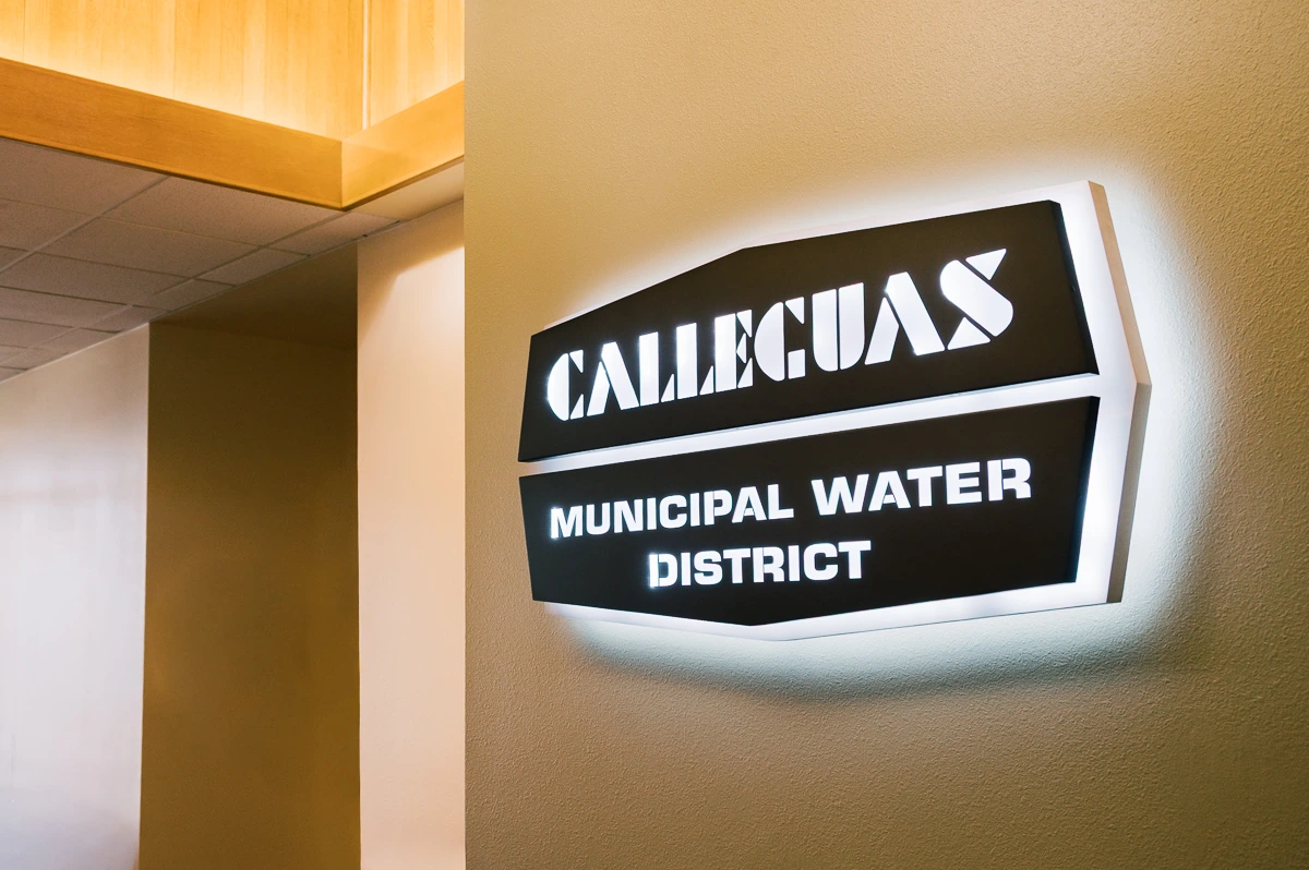
The finished sign combines brushed aluminum tones, darker face elements, and internal illumination to create a soft halo around the perimeter. That lighting approach keeps the sign visible and defined without pushing it into a retail or hospitality look. Instead of relying on brightness, the sign works through contrast, proportion, and depth. From the front it reads cleanly and directly. From an angle, the dimensional build and wall offset become more apparent, which gives the piece a more resolved presence in the space.
Design Considerations
Material choice mattered here. The brushed metal finish gives the sign a more institutional and durable character, which fits a public utility client far better than glossy or overly polished surfaces would have. The darker face areas create enough contrast for the lettering to remain legible, while the illuminated backing helps separate the sign from the wall without creating glare. The geometry is simple, but not generic. It has enough shape to feel intentional, and enough restraint to remain appropriate in a government-facing environment.
Mounting and construction were equally important. Because the sign is dimensional and illuminated, the spacing from the wall and the control of the light output had to be handled carefully. Too little separation and the sign would lose depth. Too much and it would start to feel bulky. The final result keeps the piece crisp and readable, with a consistent halo effect that reinforces the form instead of distracting from it.
The Impact
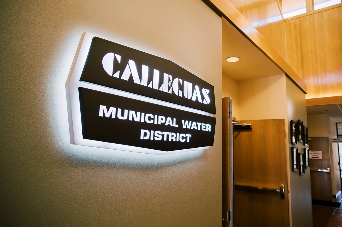
Once installed, the sign gave the interior a stronger point of identity. It now works as a clear institutional marker rather than just a name on a wall. It improves first impression, helps orient visitors, and adds a finished architectural element to the space. Just as important, it does that without overpowering the room. The sign feels like it belongs there. It supports the character of the building and gives the district a more defined presence inside its own environment.
Key Benefits
- Clear interior identification for a public-facing agency
- Dimensional construction that adds depth and permanence
- Integrated illumination with a controlled halo effect
- Material palette suited to a formal civic interior
- Custom design, fabrication, and installation handled as one system
Projects like this depend on restraint as much as visibility. The result is not loud, but it is precise. It gives the district a stronger visual presence in the building and does it in a way that feels durable, intentional, and properly scaled to the space.


.webp)