The signage package for Dole’s Westlake Village office was developed as part of a larger interior environment, where branding, navigation, and spatial identity needed to function as a single system. The project combined exterior building signage with a coordinated interior program, integrating dimensional elements, illuminated features, and large-scale graphics across multiple zones.
Rather than treating each sign as an isolated object, the scope required a structured approach where every element contributes to a consistent visual language throughout the space.
Description & The Challenge
This was not a single-installation project. The scope included exterior identification signage and a full interior package distributed across entry areas, shared spaces, corridors, and feature walls. Each category of signage served a different purpose, ranging from primary brand visibility to informational and narrative functions.
The primary challenge was maintaining coherence across different conditions. Exterior signage required durability, visibility at distance, and integration with the building фасция. Interior elements had to respond to varying lighting conditions, ceiling heights, and architectural features, including curved walls and open structural ceilings.
At the same time, the signage needed to align precisely with Dole’s established brand system. This imposed constraints on color usage, typography, and proportions, limiting flexibility while increasing the importance of execution accuracy.
The Solution
The final solution was built as a layered system with clear hierarchy. The exterior sign establishes primary brand visibility through fabricated channel letters with integrated illumination, mounted in alignment with the building architecture.
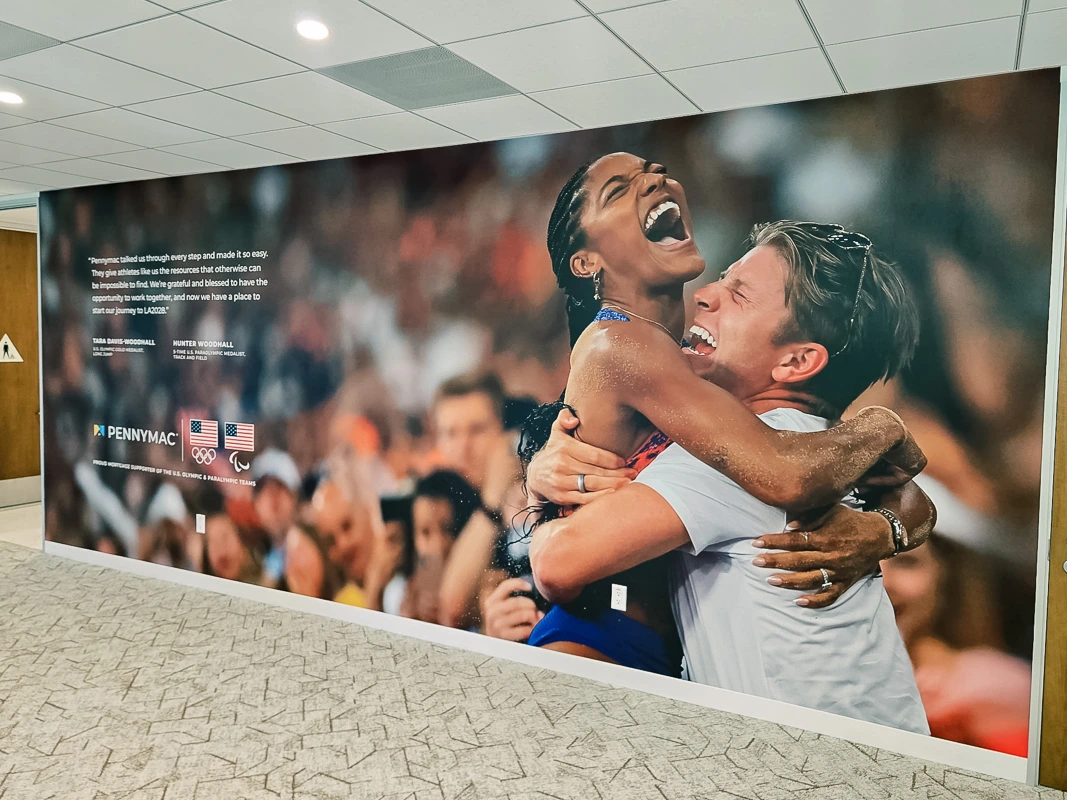
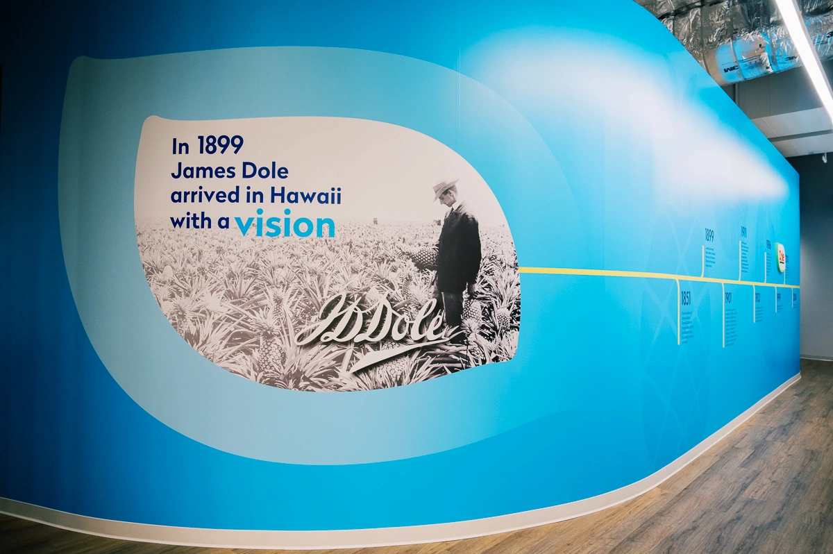
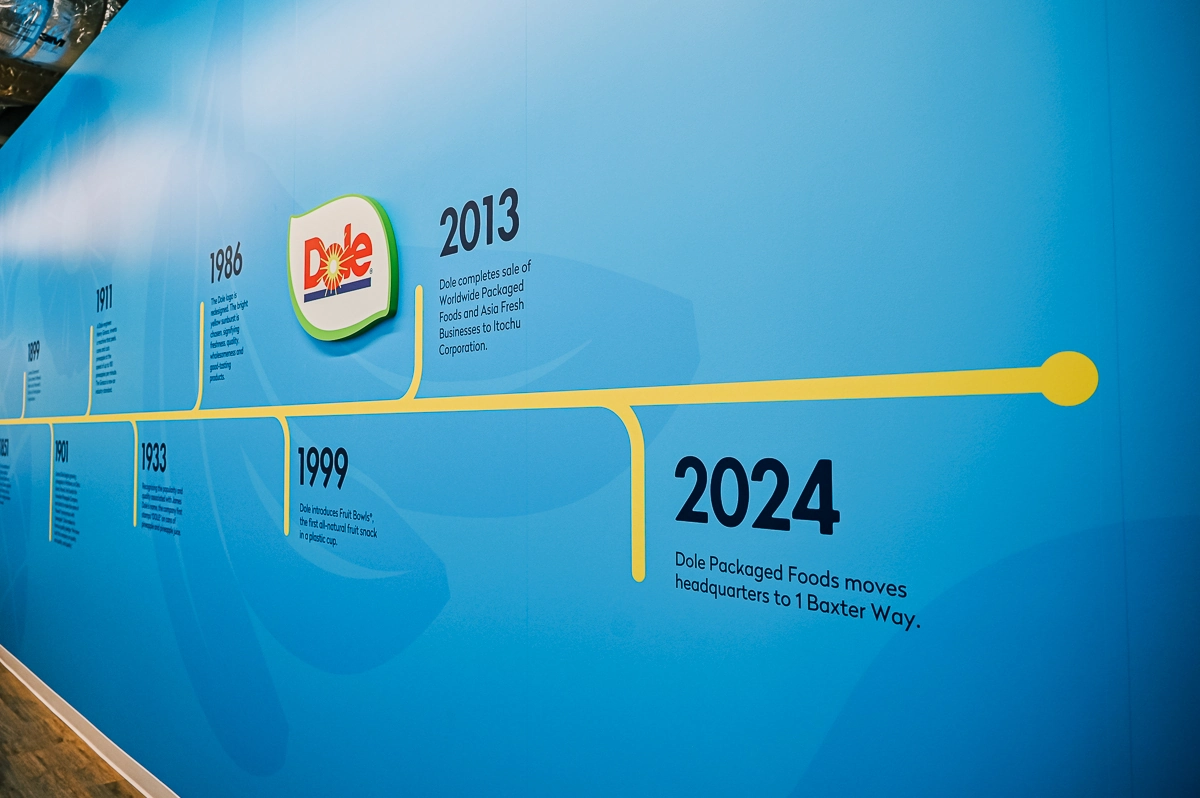
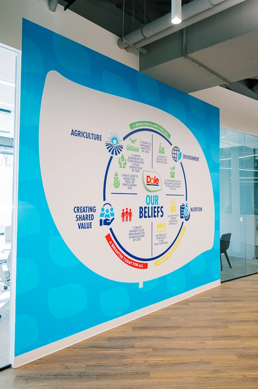
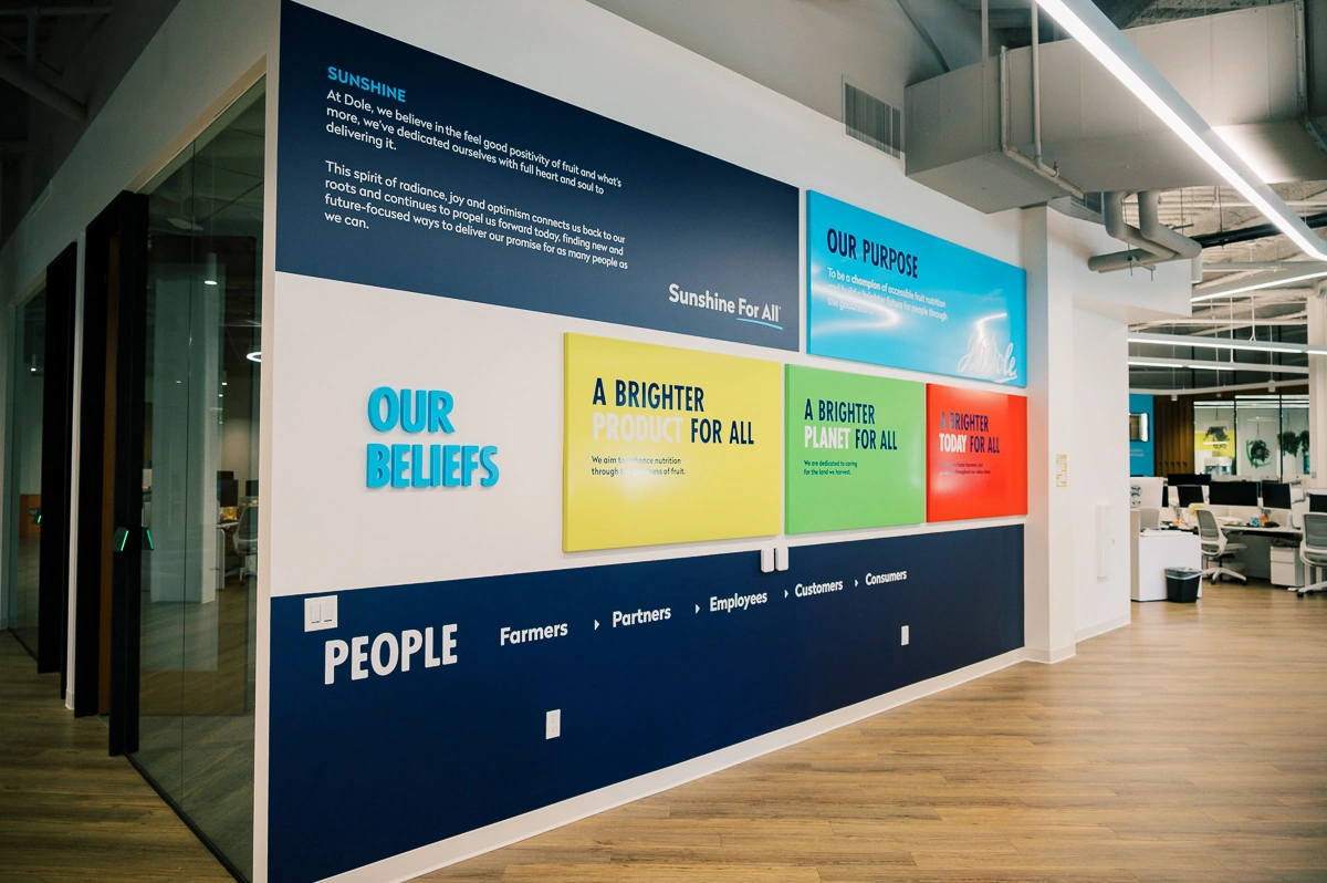
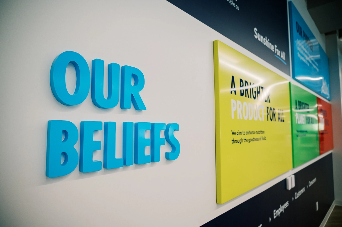
Inside the space, the approach shifts from visibility to experience. Dimensional lettering is used selectively in key locations to reinforce brand presence without overloading the environment. Large-format wall graphics introduce structured content, including brand messaging and historical narrative elements, allowing walls to function as informational surfaces rather than purely decorative ones.
Feature installations, such as suspended lettering elements, create focal points within shared areas and help define zones without introducing physical barriers. The system works through distribution and hierarchy, not repetition.
Design Considerations
Several factors directly influenced execution. Lighting conditions varied significantly across the space, from natural daylight near glazing to controlled artificial lighting in deeper interior zones. This required careful calibration of contrast, material finish, and letter depth to maintain readability without creating visual noise.
Material selection followed function. Exterior elements required aluminum construction, acrylic faces, and integrated illumination systems designed for longevity and serviceability. Interior signage relied on painted finishes, acrylic components, and digitally produced graphics, prioritizing consistency and clean integration with wall surfaces.
Scale was another constraint. Large wall areas demanded compositions that hold from a distance, while smaller zones required restraint to avoid visual clutter. This balance was particularly important in open-plan areas where multiple elements are visible simultaneously.
Finally, mounting and detailing had to remain unobtrusive. Electrical components, raceways, and supports were integrated into the structure wherever possible to preserve a clean appearance.
The Impact
The completed signage does not read as a set of independent installations. It functions as part of the architectural environment. Movement through the space is supported by clear visual anchors, while large-format elements provide context and reinforce identity without interrupting workflow.
Brand presence is consistent but controlled. There is no overuse of signage, and no single element dominates the space unnecessarily. Instead, the system relies on placement, proportion, and hierarchy to guide perception.
The result is an environment where signage supports orientation, communicates identity, and integrates with the interior rather than competing with it.
Key Benefits
- Coherent signage system spanning exterior and interior environments
- Clear hierarchy between identification, informational, and narrative elements
- Integration with architectural features, including open ceilings and curved surfaces
- Controlled use of dimensional and graphic elements to avoid visual overload
- Consistent execution aligned with established brand standards
Projects of this scale require coordination across design, fabrication, and installation phases, with attention to both technical constraints and spatial context. The effectiveness of the result depends not on individual elements, but on how consistently the system is applied across the entire environment.


.webp)